Manop’s collection @ M+ Research Centre, Hongkong
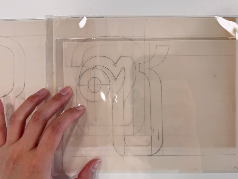
I found this link on June 1, 2024, and have known that I will go to Hong Kong ever since.
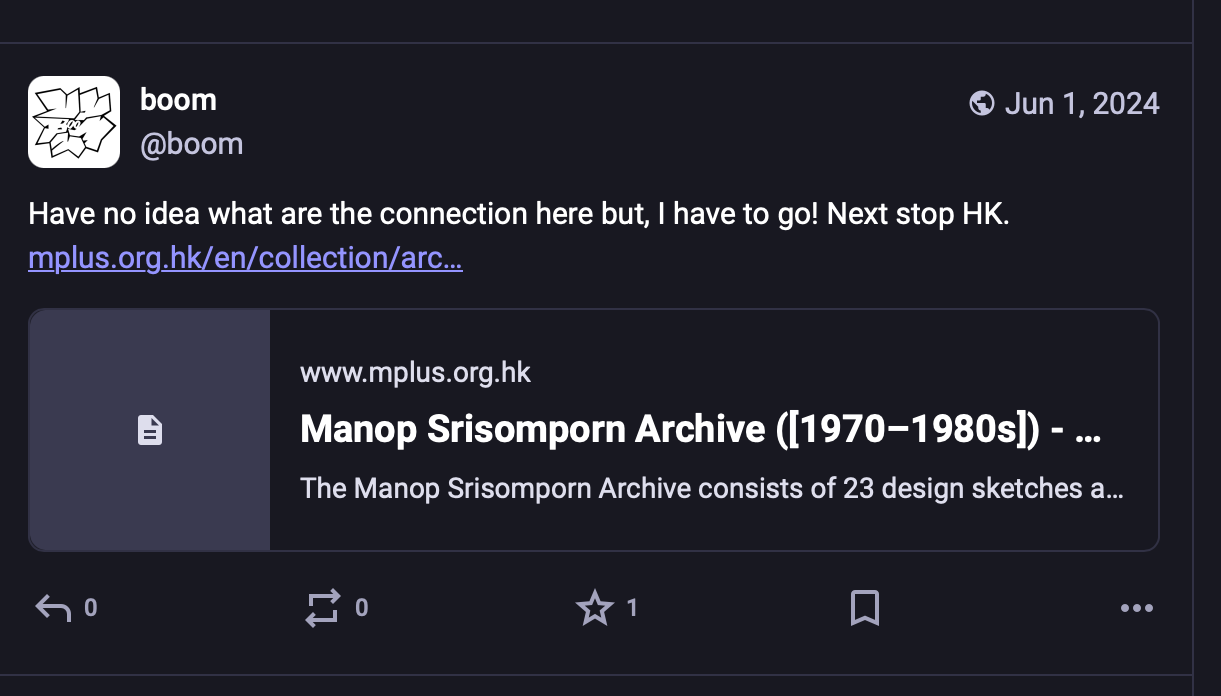
I sent an email to the research centre once I knew my plan in January: This year, in 2025, I was coming back to Thailand from March to April. After I got a confirmation from the research centre, my trip to Hong Kong in the first week of March was made right away.
The date for visit covered two days, Tuesday and Thursday, only to look at 74 items of Manop's archive. Yes, I want to see all of them, every single pieces.
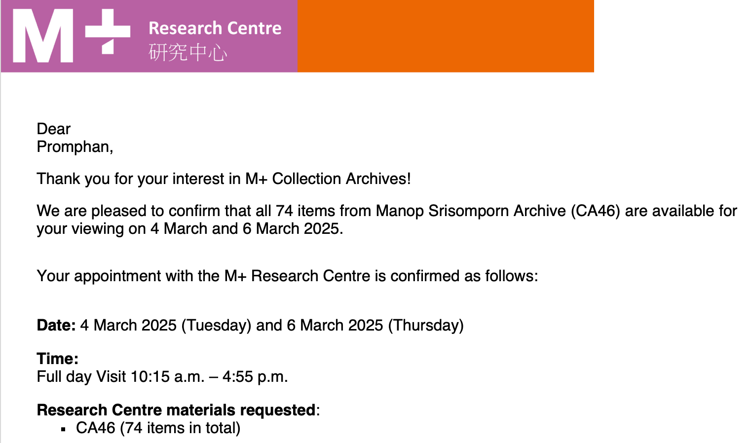
You've no idea how excited I am for the trip! Desperate. I mean, I've never seen Thai typography archives elsewhere, not even in Thailand.
Once I discovered this archive, I asked around, but nobody seemed to share the same interest or know much about it. So, I booked a ticket for myself and a hotel for one. My stay covered both dates, and I received a confirmation email with detailed instructions on how to get there and the do’s and don’ts.
I found myself rereading those instructions multiple times, afraid of missing something—they were incredibly specific. They even mentioned not licking your finger while flipping the pages! There was no room for personal interpretation. I loved the precision, yet reading through it made me feel a bit anxious. I wasn’t sure what I was getting myself into.
You can check it out yourself ;-) : M+ Research Centre
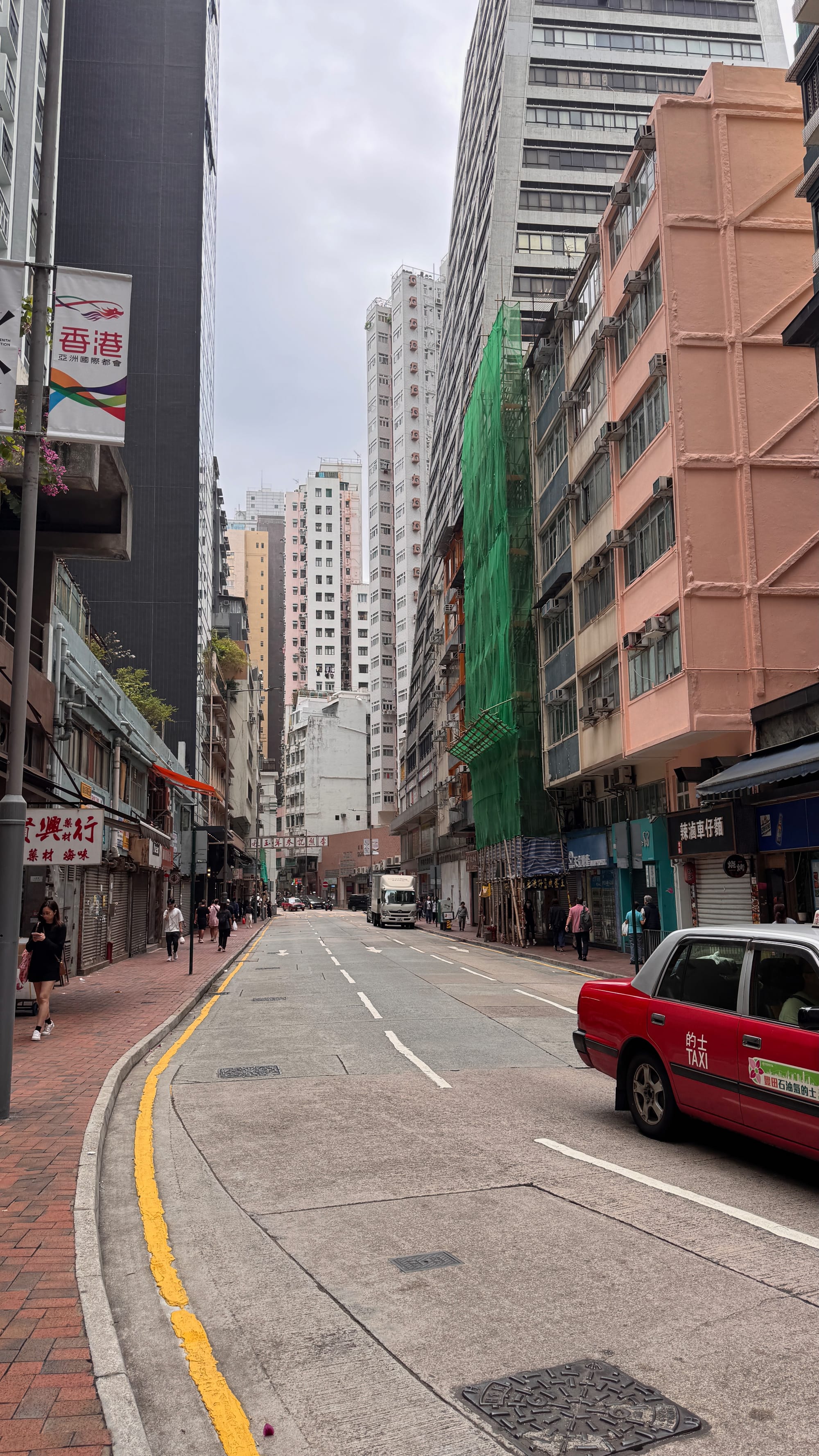
These shirt wrinkles reflect my mood perfectly. The hotel wasn’t what I expected, and due to my lack of research, it’s also in the most expensive area of HK. The only good thing? It’s surrounded by co-working spaces! I love Deskimo—a co-working space booking app that all you expat folks who love (or have to) travel with a laptop might need.
Google Maps may make it seem like an easy walk, but NO—it’s not! During this trip, I went there three times, and each time, I somehow found a better route.
Here’s my big hint: follow the signs for ‘West Kowloon Cultural District’—whether you know what it is or not. They’ll lead you straight to the M+ building.
I’m not sure if there’s a way to access this place by public transportation without going through the shopping mall, but every time, I walked through it. Just remember to follow those signs, and you’ll be alright!
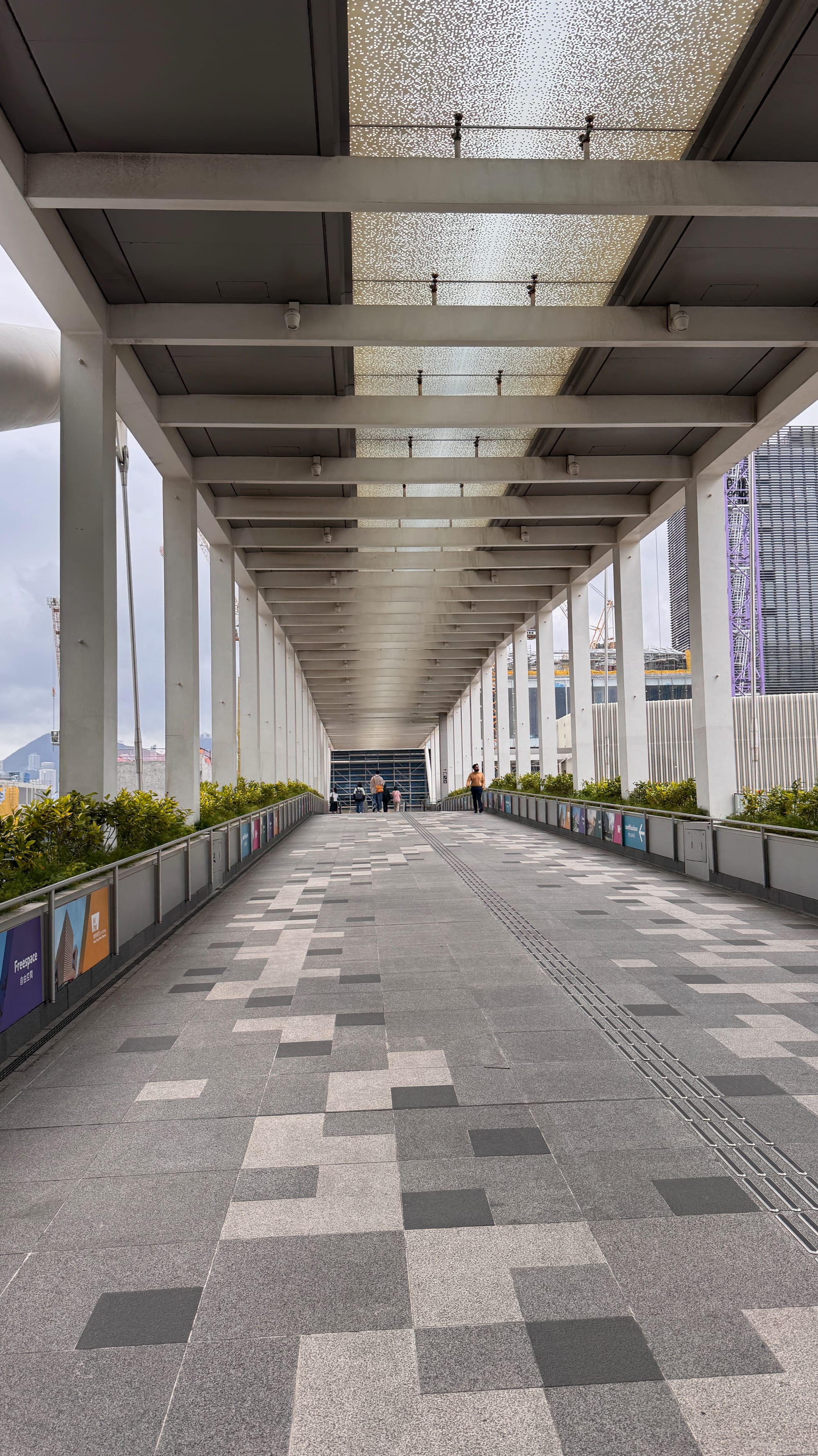
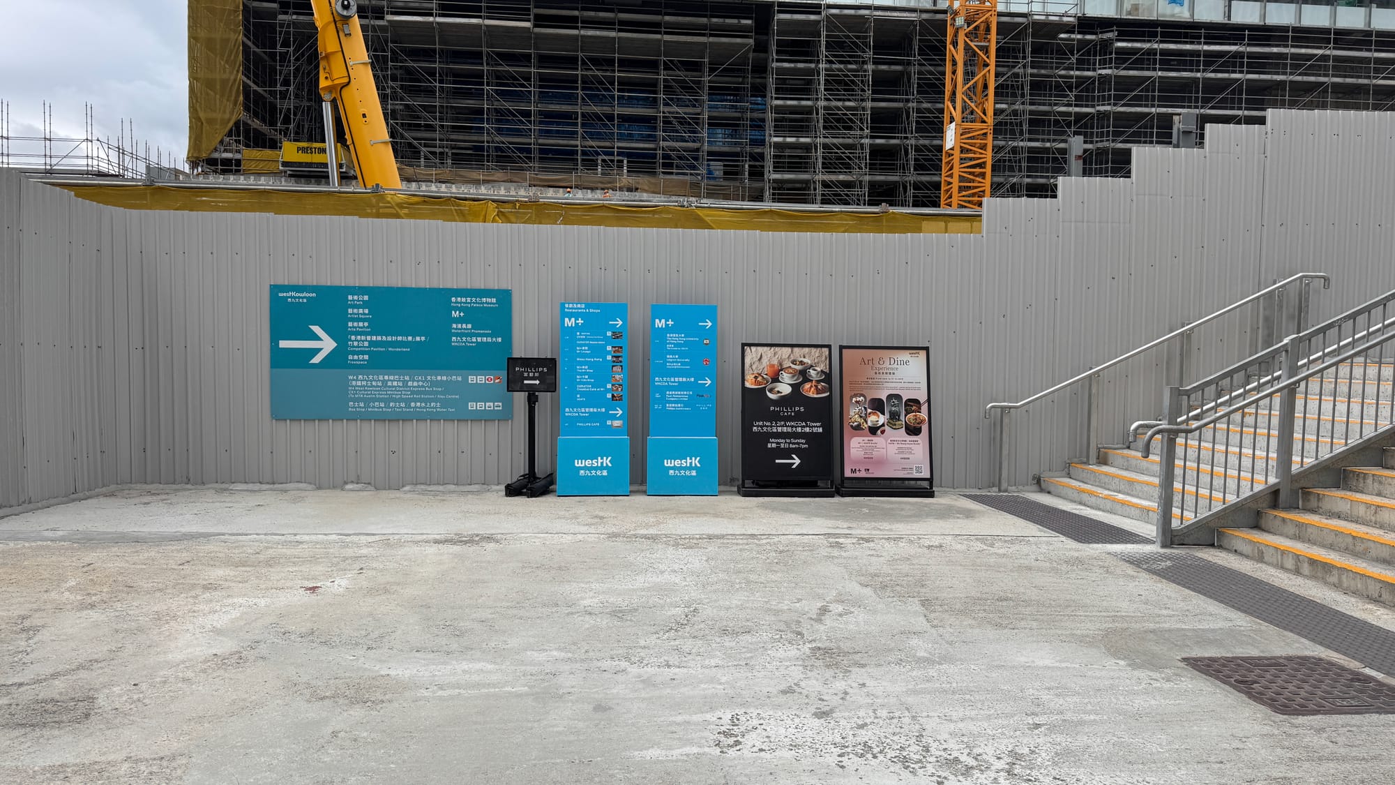
Once you cross the bridge and go down the escalator in the semi-outdoor area, you’re on the right path.
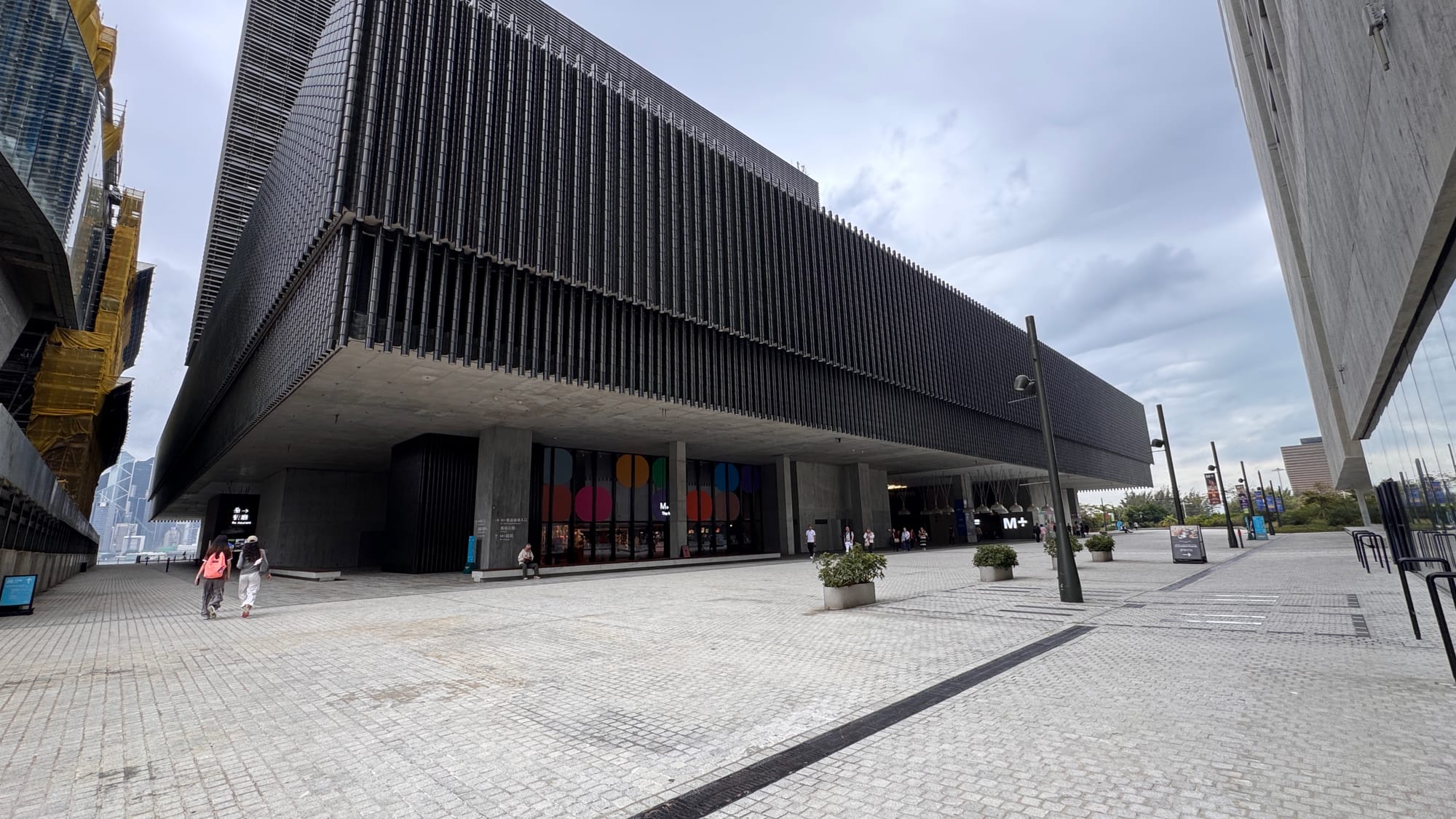
It will lead you to this gigantic yet sophisticated building, and I love the details. The archive confirmation email will tell you exactly where to look and which floor to head to! One thing they don’t mention is that it’s quite a large space once you enter the building. A couple of notes from me: The elevator is on your right once you enter, and you don’t need to buy an M+ entrance ticket unless you plan to go to the exhibition afterward.
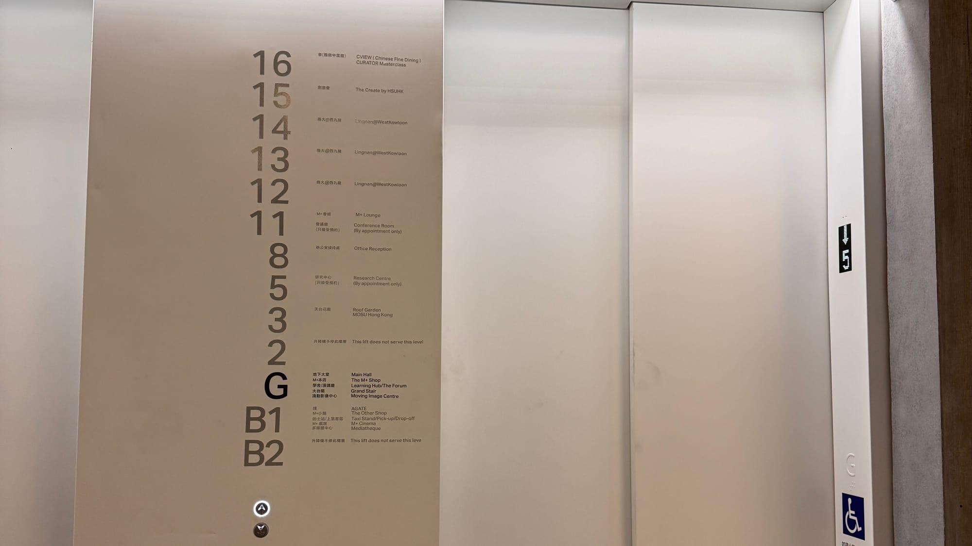
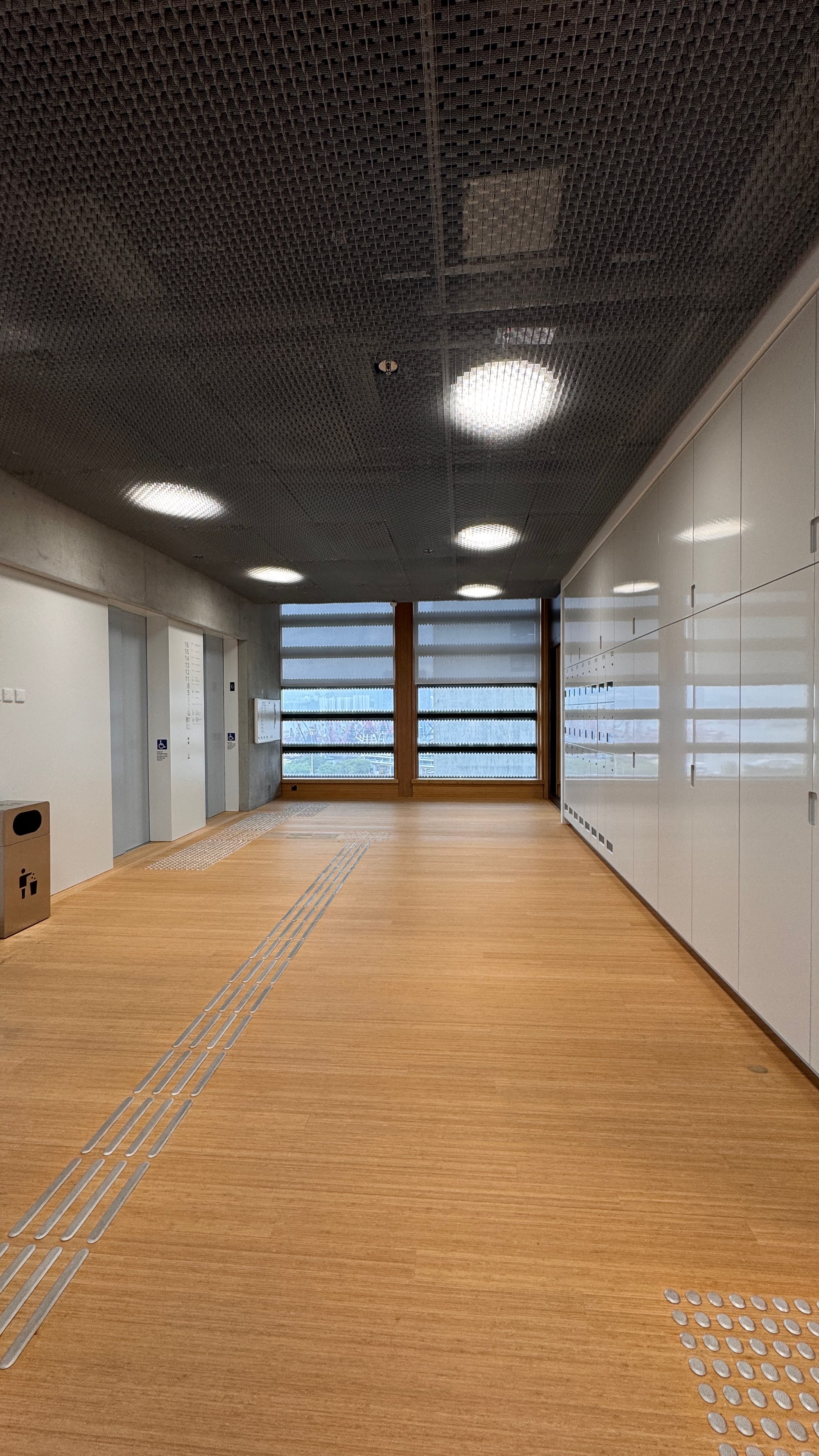
The front area of the research center on the 5th floor.
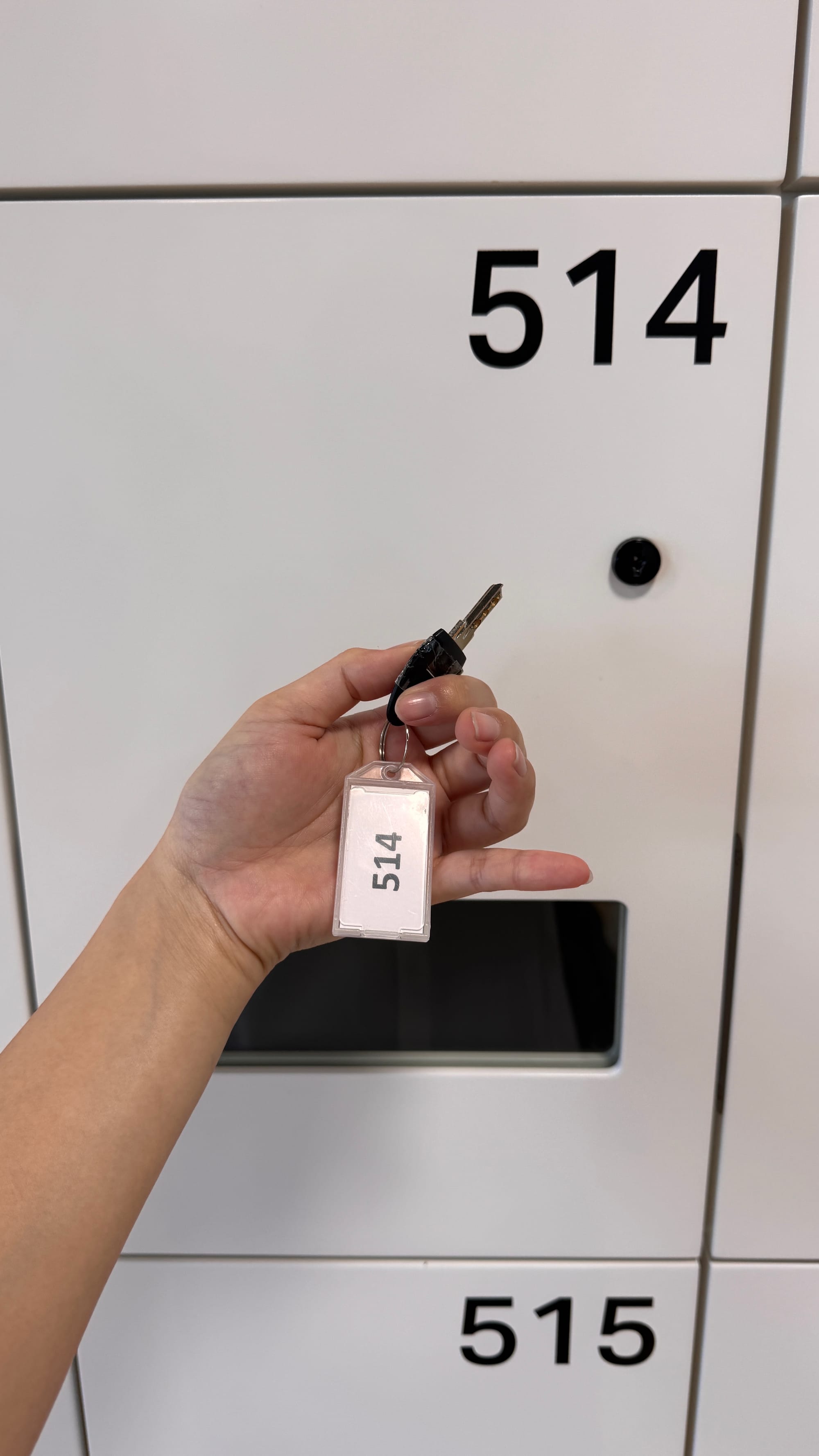
As you exit the elevator, you’ll see the lockers in front of you. Head to the doorbell on the right to meet your archivist! She’ll give you a locker key, and you’ll need to store everything except your laptop, pencil, notebook, and camera (if you have one). “No flash” is a global standard, but just in case you’re unaware, I’ll mention it again.
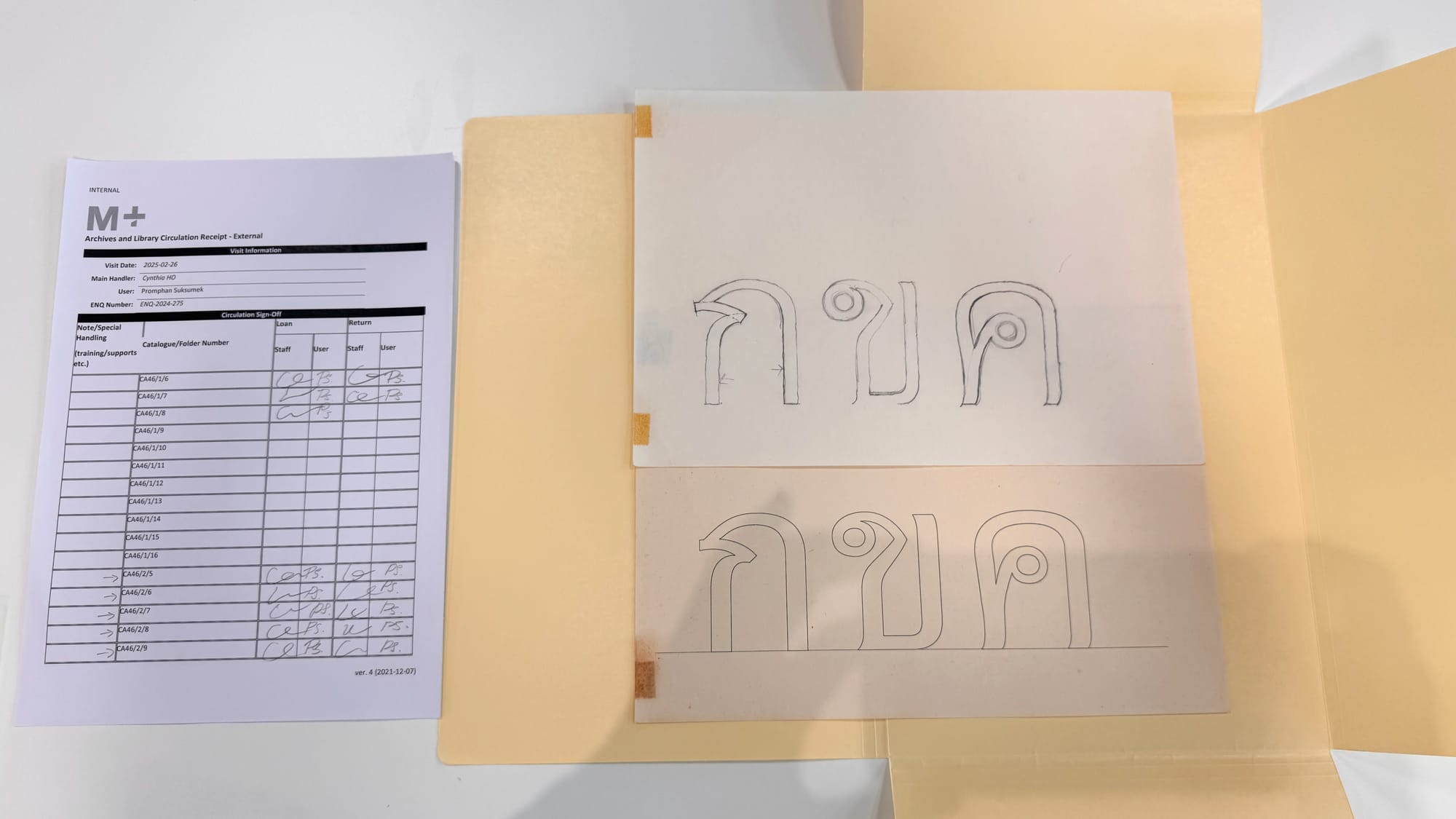
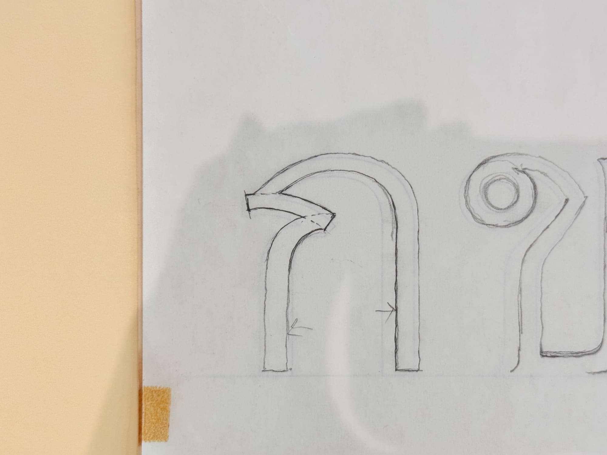
On the left is the paper listing my requested catalogue. With the catalogue
Manop Srisomporn Archive contains 23 design sketches and typefaces, along with 51 dry lettering sets, showcasing his work across the dry transfer, phototypesetting, and digital eras from the 1970s to the 1980s. Srisomporn, an accomplished freehand typographer and calligrapher, was a key figure in the development of Thai type design. The archive includes both his ‘looped’ and ‘loopless’ typefaces. Notably, he pioneered the loopless Manoptica font in response to the popularity of the Helvetica font. His expertise in advertising influenced his focus on legibility, leading to widespread adoption of his MANOP typefaces for signage, including the use of MANOP 5 as an unofficial road sign standard. The archive, was donated by Srisomporn in 2018. (Resource: https://www.mplus.org.hk/en/collection/archives/manop-srisomporn-archive-ca46/)
Cynthia Ho is my archivist on this research journey. When I arrived, she had already prepared the requested catalogs for me. Throughout the process, we both had to sign to confirm the catalogs or items I received. Once I was done with an object, I had to sign for its return, with Cynthia confirming she had received it. So, choose your signature wisely! ;-)
There aren’t many hand sketches, but some proofs are present. Most of the materials are dry transfers, which wasn’t much of a surprise to me. Manop Srisomporn was a well-known type designer of that era.
One thing I found different this time was how I could immerse myself in a single piece of dry transfer for much longer than usual. Typically, you’d find dry transfers in a market-like setting or someone’s house—unless you had your own, where time to examine them was always limited.
This time, I even noticed a new design—both in layout and typeface—that I had never seen before.
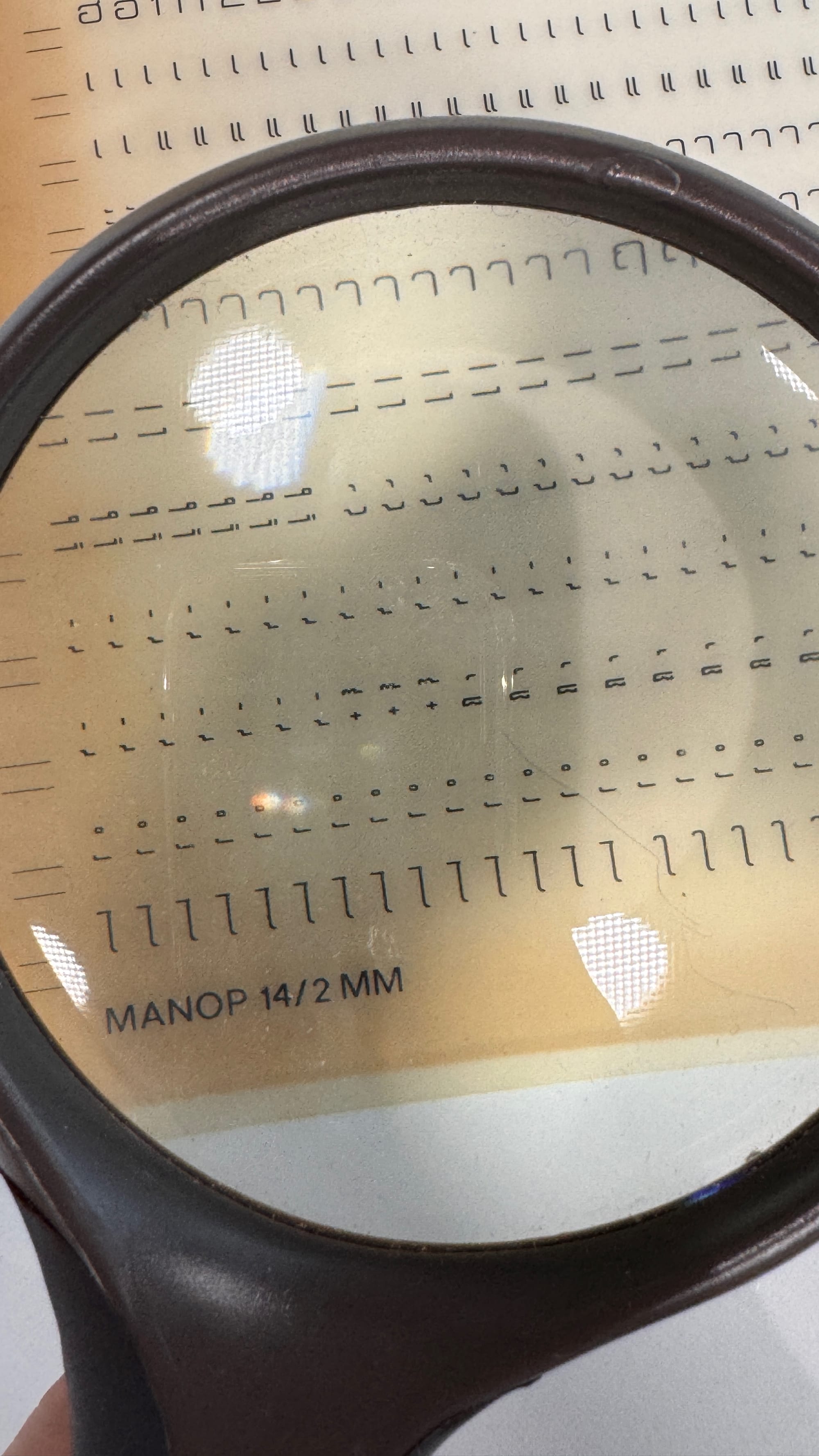
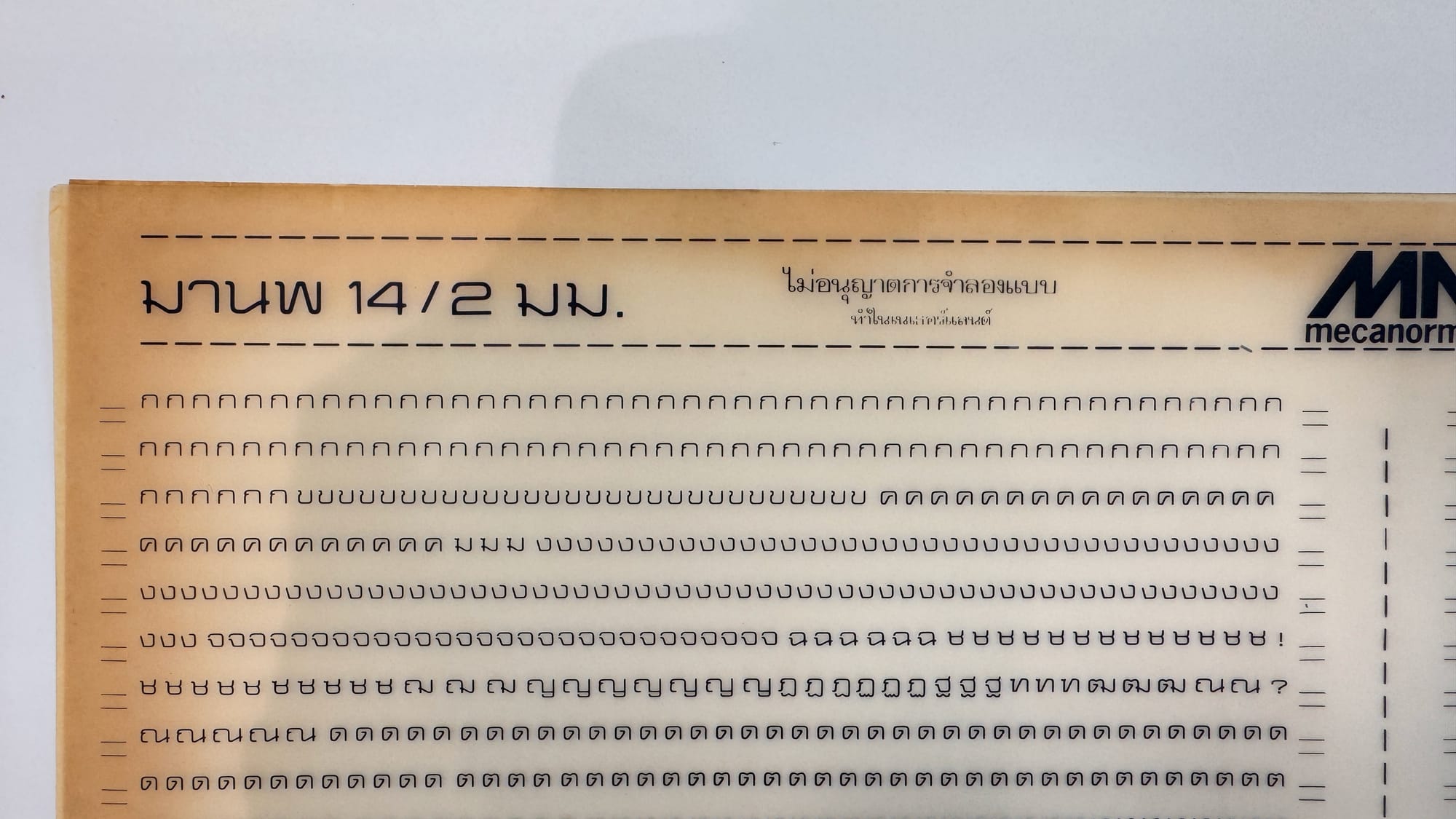
On the left: At the research center, they also provide magnifying glasses for your use. On the right: No.CA46/2/9 Dry transfer lettering set, Manop 14, 2 mm
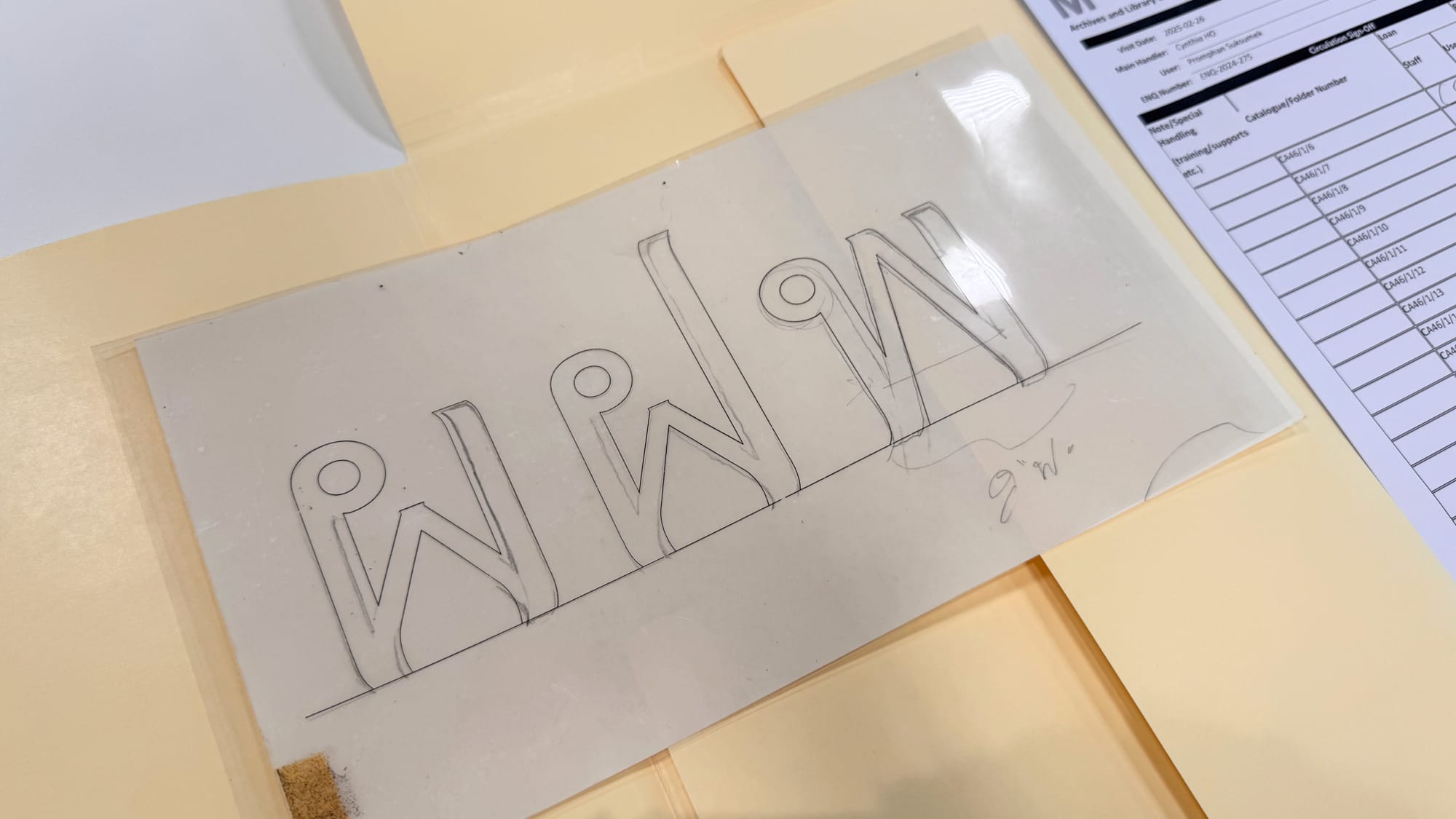
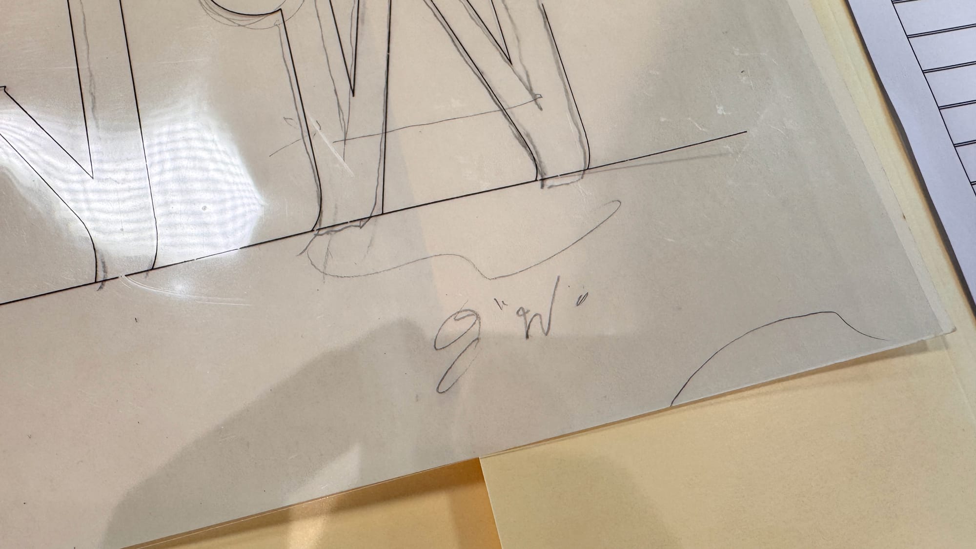
No. CA46/1/6 Design sketches for photocomposition type, ผ, ฝ, and พ
These pieces above are another set of outline sketches, and the comment at the bottom by the designer really touched me. It’s rare to find Thai comments from a Thai type designer, especially in this archive setting.
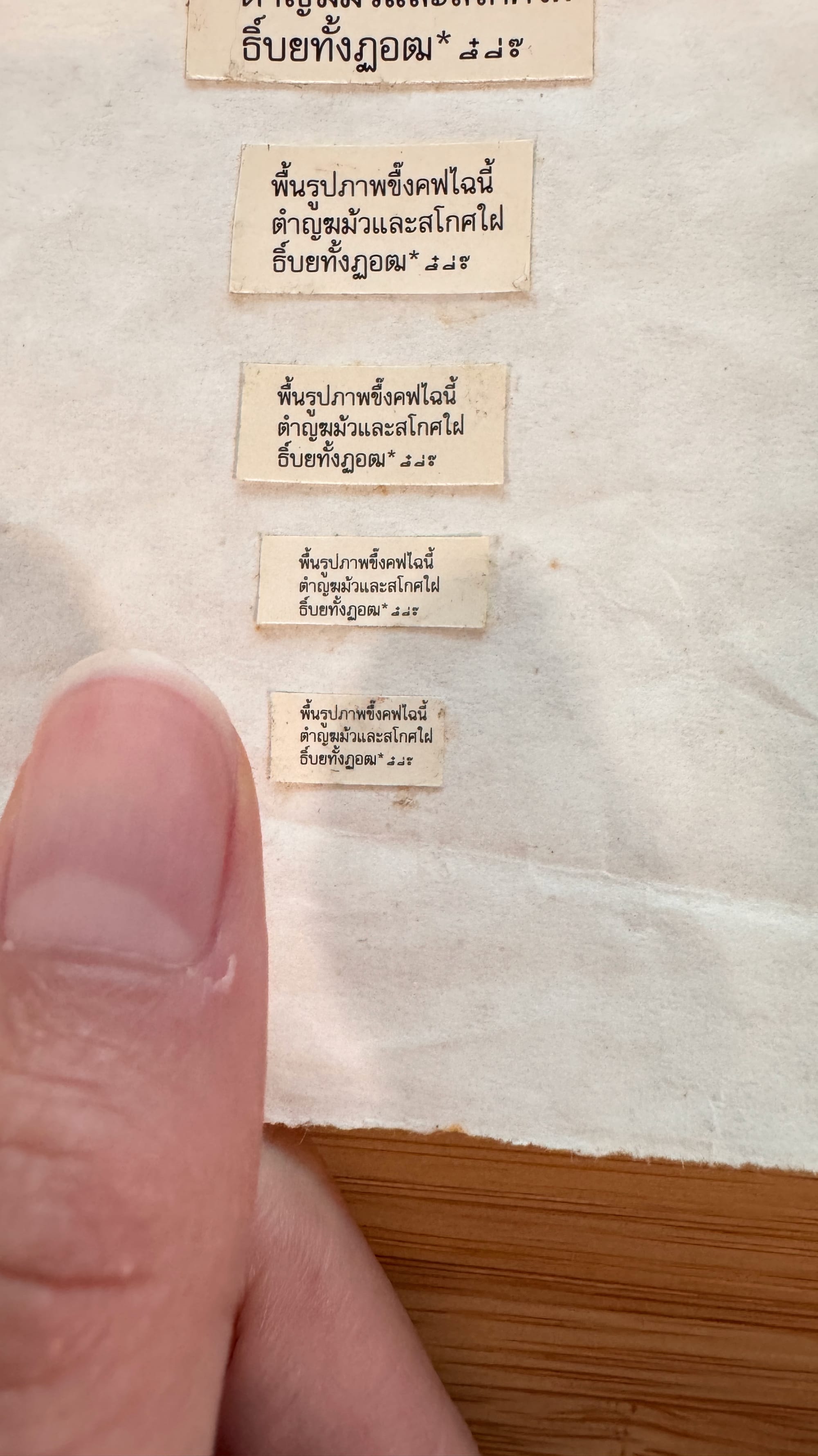
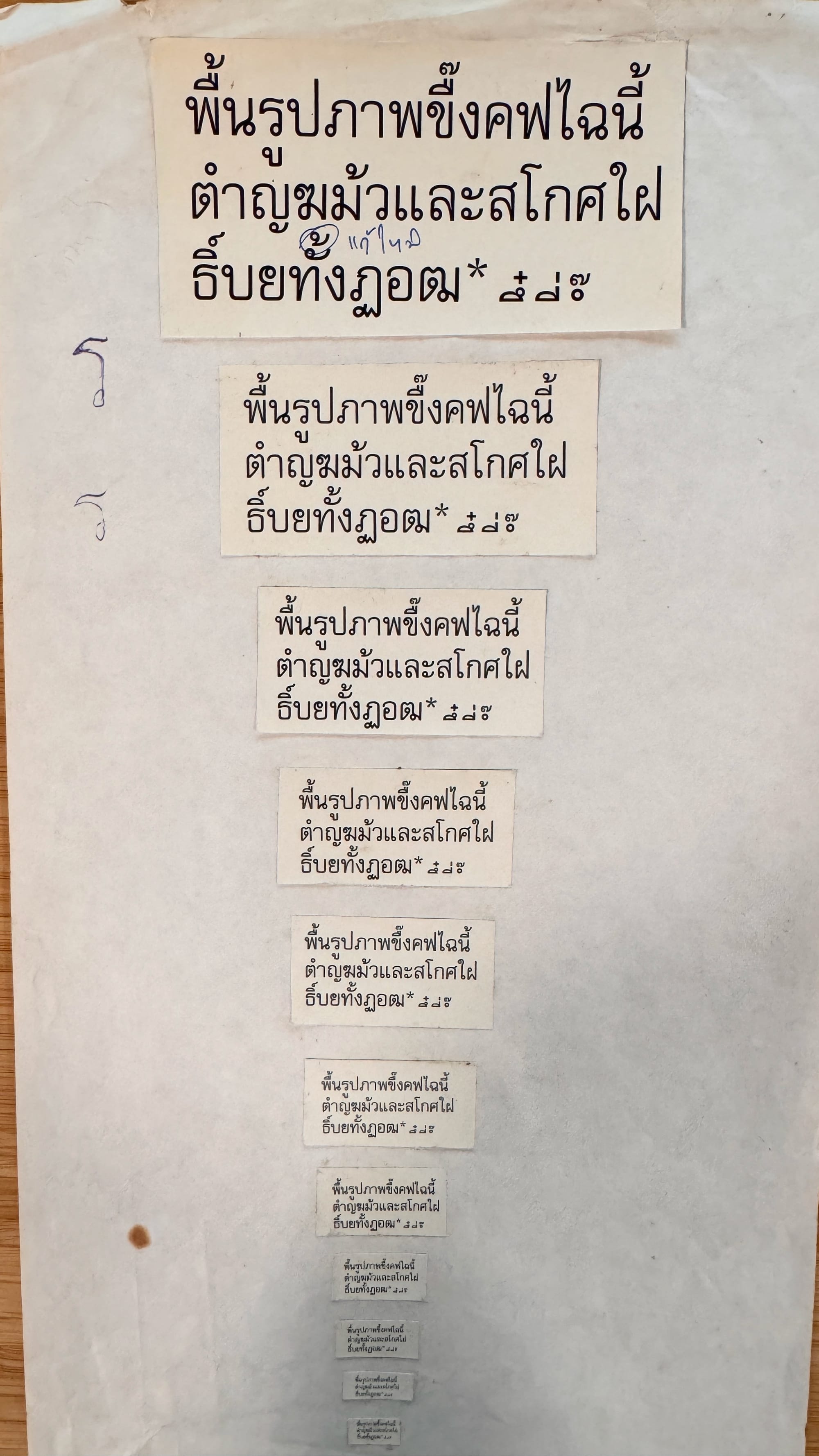
No. CA46/1/14 Test print for Thai font set. The proof ranges from big to small sizes. Compared to my thumb, it is really small!
These are letter proofs that I find fascinating. The document reveals how the process was done in the past. The plate contains only key letters and tone marks, making it interesting to observe which ones were considered essential!
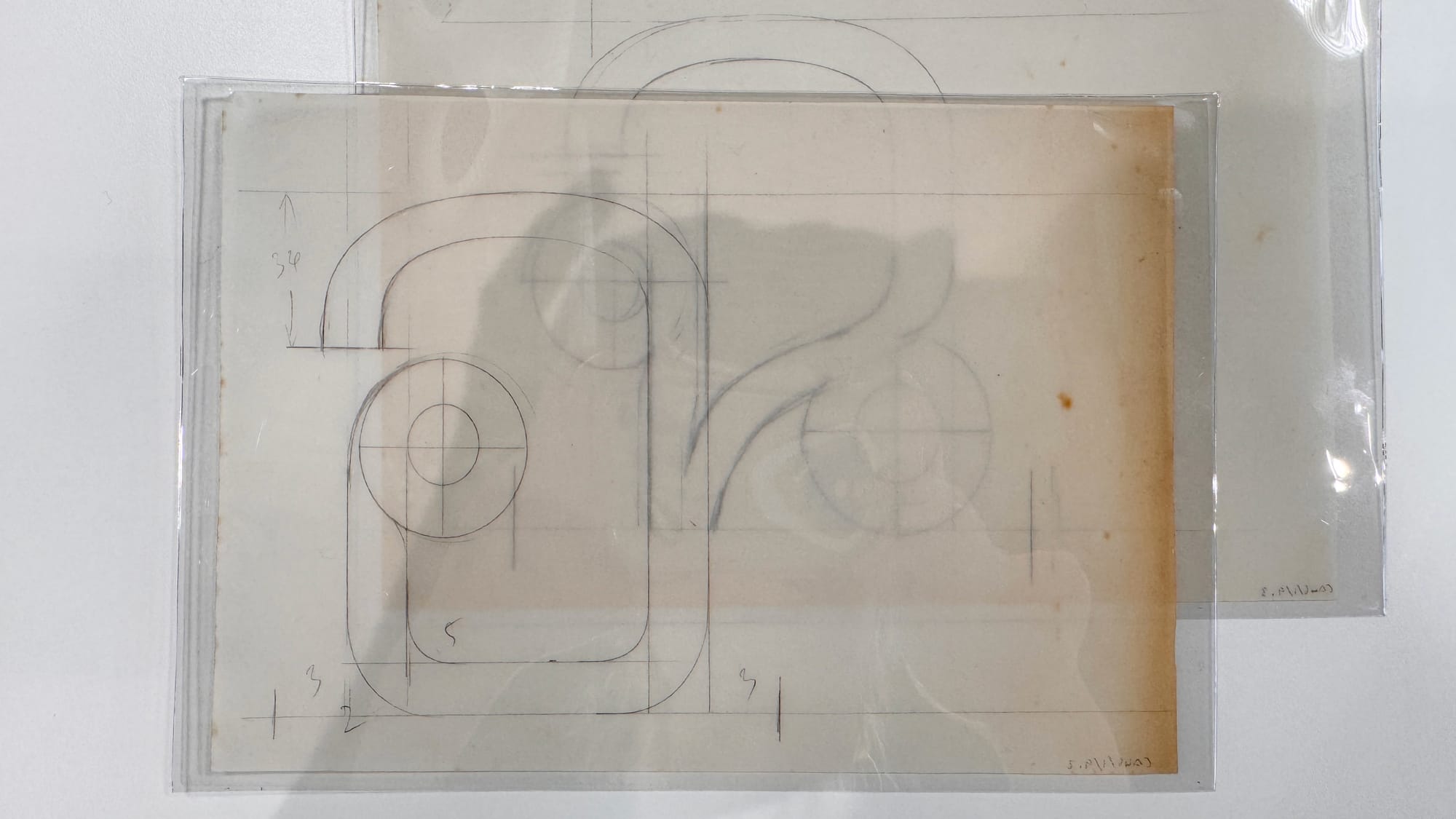
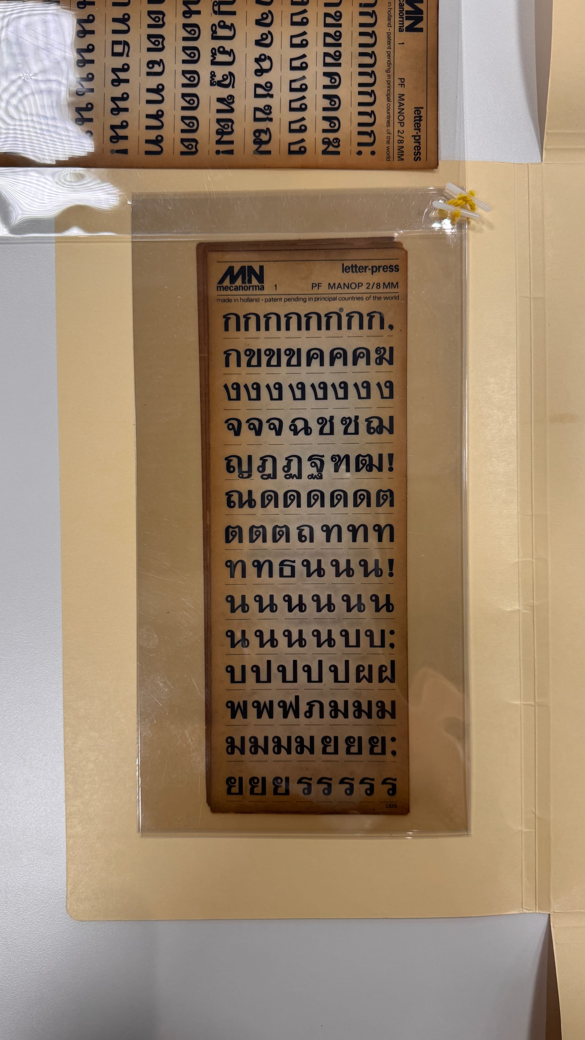
On the left: No. CA46/1/9 – Design sketches for photocomposition type, ซ, อ, and ฉ, Nopporn typeface. On the right: No. CA46/2/10–16 – Small-size dry-transfer with a custom-made plastic sheet and binding.
This is the first time I’ve seen original sketches from a first-generation Thai type designer, which was very exciting for me. Unfortunately I had to let go of the idea of interviewing or speaking with Srisomporn himself, given his advanced age.
I took notes on almost every single piece and photographed many of them over the course of my two-day appointment. Cynthia was with me on both days, patiently waiting as I examined each piece. I truly appreciate her patience.
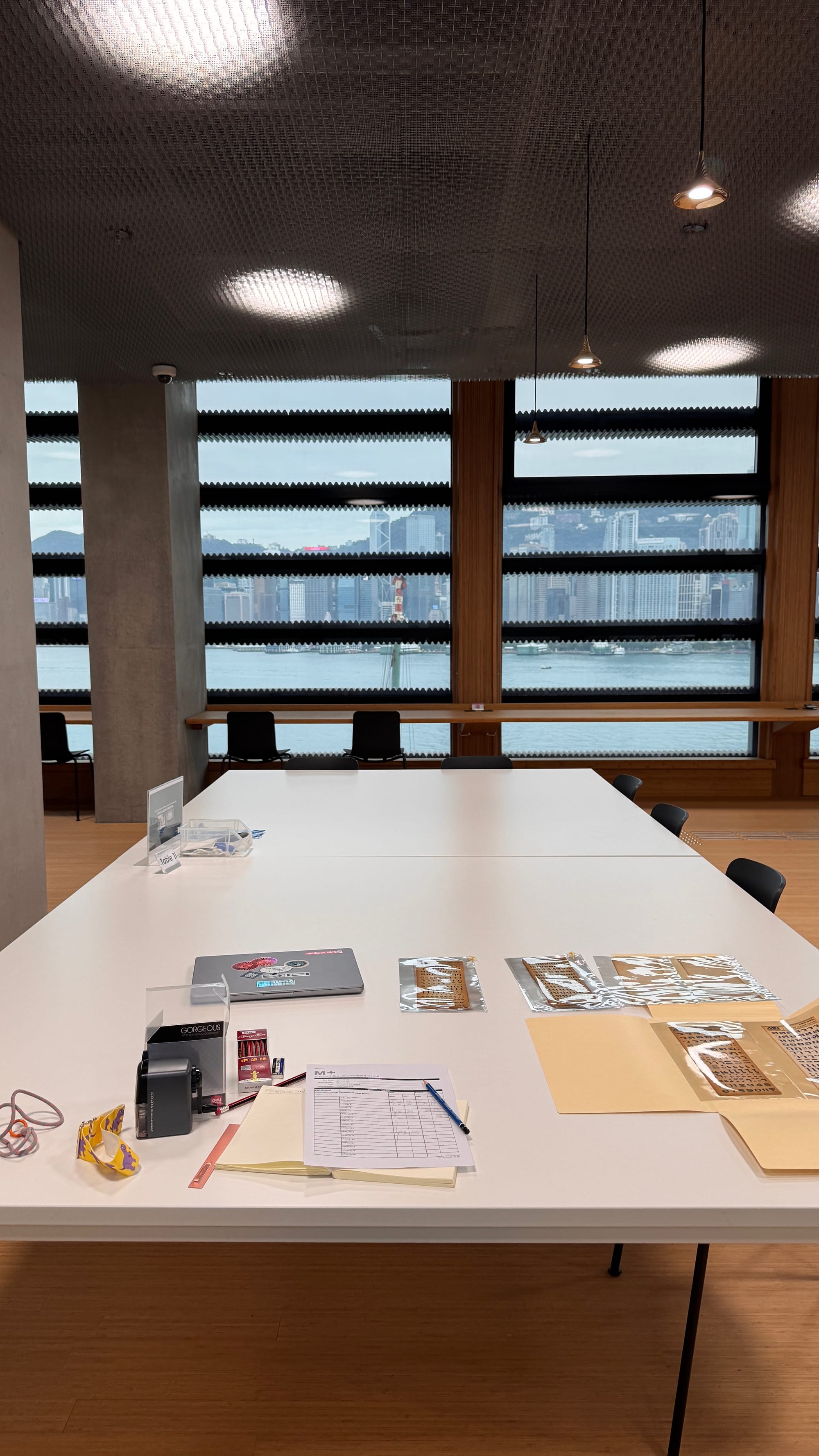

Although the cost of viewing Thai sketches by Thai designers in Hong Kong may be considered pricey and not easily accessible for young designers or students due to budget constraints, I still have to admit that the M+ Research Centre makes it worth your time if you’re considering a visit.
All the items are well-preserved, and there’s much more than what I’ve shared here, including other art and culture-related materials. They’ve made everything easily accessible. For delicate pieces, they ensure accessibility by placing them in transparent plastic sheets, allowing you to flip through and compare if needed.
Cynthia mentioned that they have a dedicated floor with controlled humidity and room temperature to properly store their collection. The environment at the research center is calm and peaceful, offering a perfect space for focused work and deep concentration.
The only downside is the limited lunch options. While there are many sit-down restaurants, quick lunch choices are scarce. You can opt for sandwiches or Oden from an outdoor semi-truck. My friend mentioned a hamburger food truck, but it was closed on the weekdays I visited.
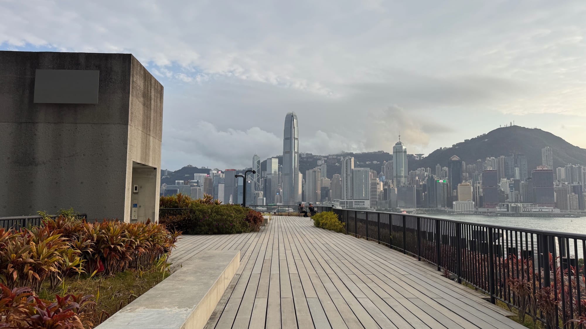
The view is a solid 10/10—imagine enjoying ice cream on a hot summer day with this view, which would be a perfect scenario. Though it was cloudy, windy, and rainy during my visit, I still had ice cream at the end of the day. I learned that this ice cream brand (whose name I can’t remember, but you’d recognize it by the look) is worth every calorie.
Overall, I highly recommend the M+ Research Centre. It’s a fantastic place to visit. Photos are generally not allowed to be shared on any platform unless you have approval from your archivist, and I had to ask Cynthia for permission to share this one.
I hope you enjoyed the read! If you plan a trip to Hong Kong and want to visit the research center, I hope this article gives you a convincing overview of the place. :)
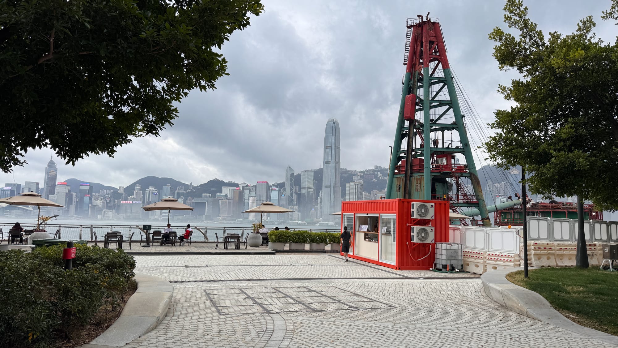
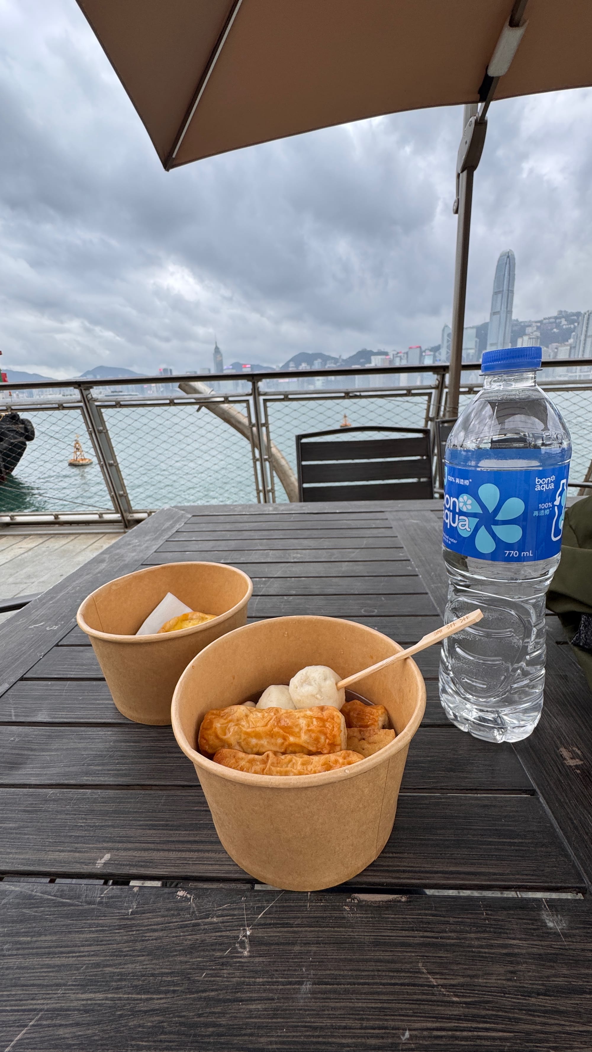
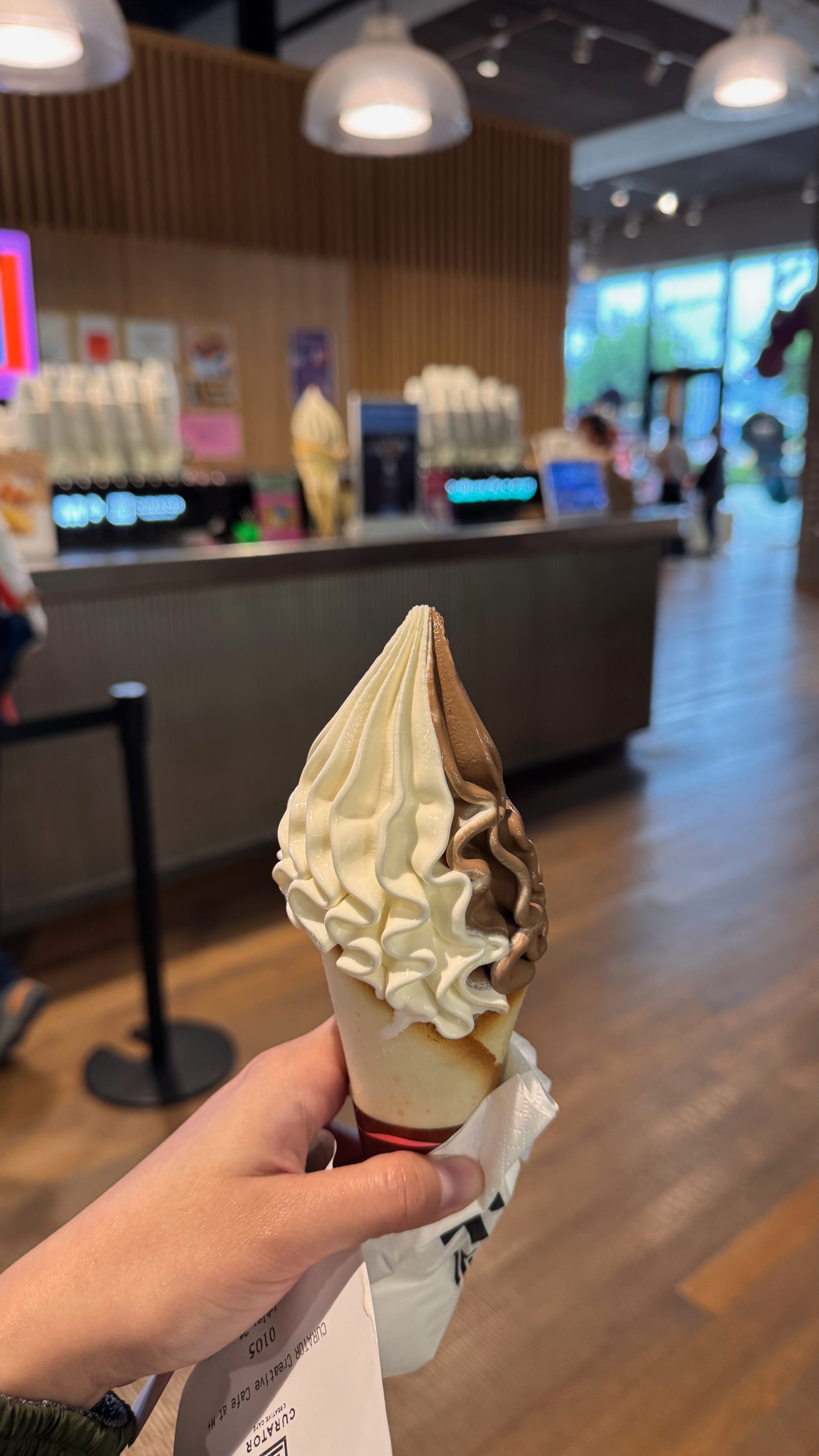
My first day's food at the Udon place (the red box) with some egg tart and my last day ice cream.


Comments ()