Klingspor Museum
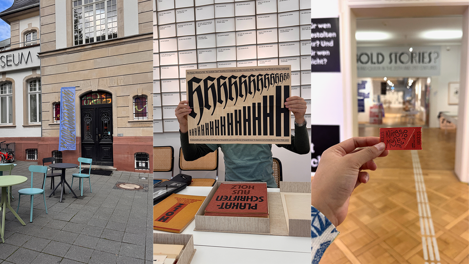
In early October this year, I finally had a chance to visit the Klingspor Museum. I first learned about this place in 2019 and had always wanted to visit. However, once I came back to Europe for TypeMedia in 2021, it was during the pandemic. So, traveling to Germany (or anywhere else outside of the Netherlands) was a big problem for me — I had to change my type of vaccination and wait for it to be effective — each step takes months. So, for me, the plan to visit the Klingspor museum back then was impossible. However, after graduating, I finally had time and opportunity for Klingspor!
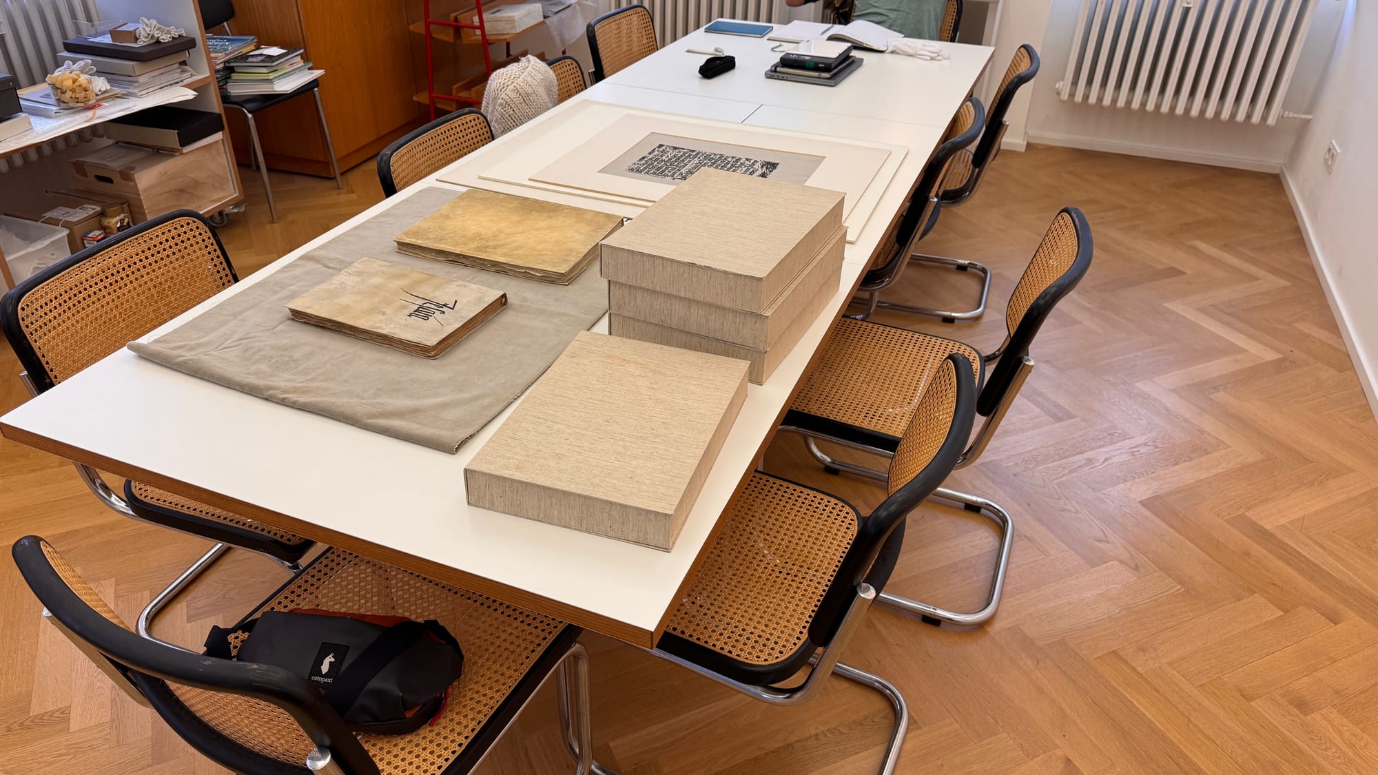
We prepared by making an appointment via email. I was not looking for anything specific; I just wanted to visit the archive — and, of course, see some of Rudolf Koch’s famous work. I was aware that there are many other calligraphers and type designers there, so I was excited about making new discoveries as well. It was a good Thursday, we arrived at 9 am and stayed until they closed in the afternoon. I took tons of photos, and it is impossible to post them all. I have only picked some of my favorites here.
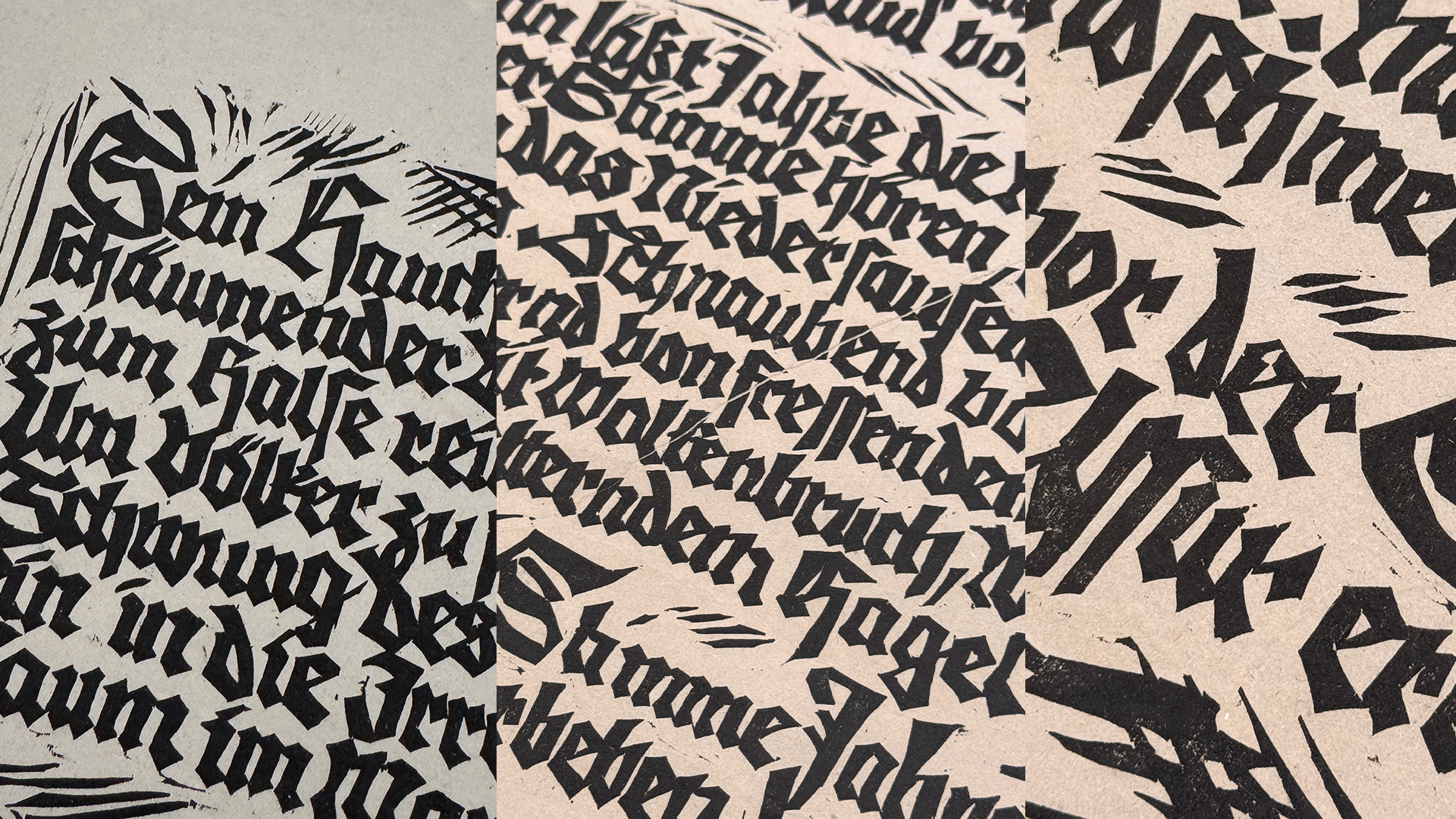
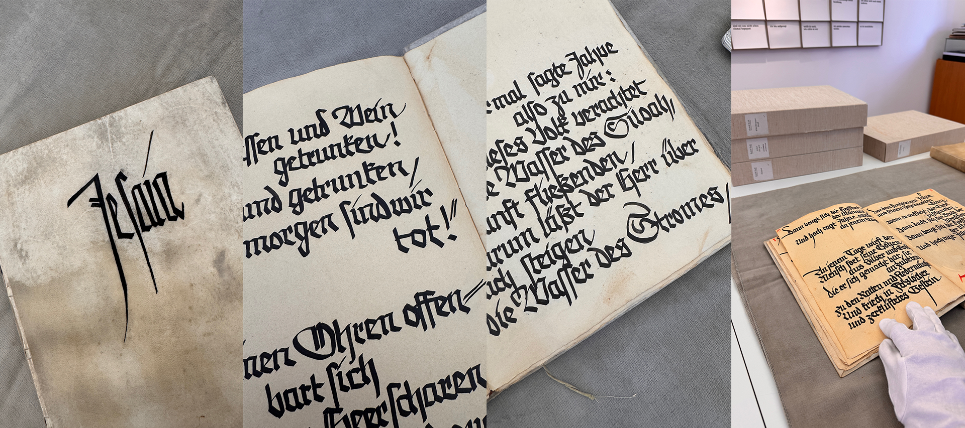
Rudolf Koch's woodcut or linocut
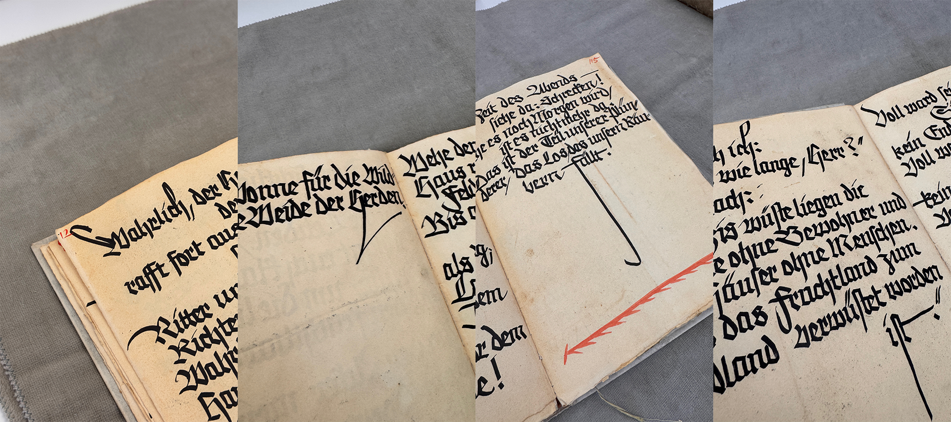
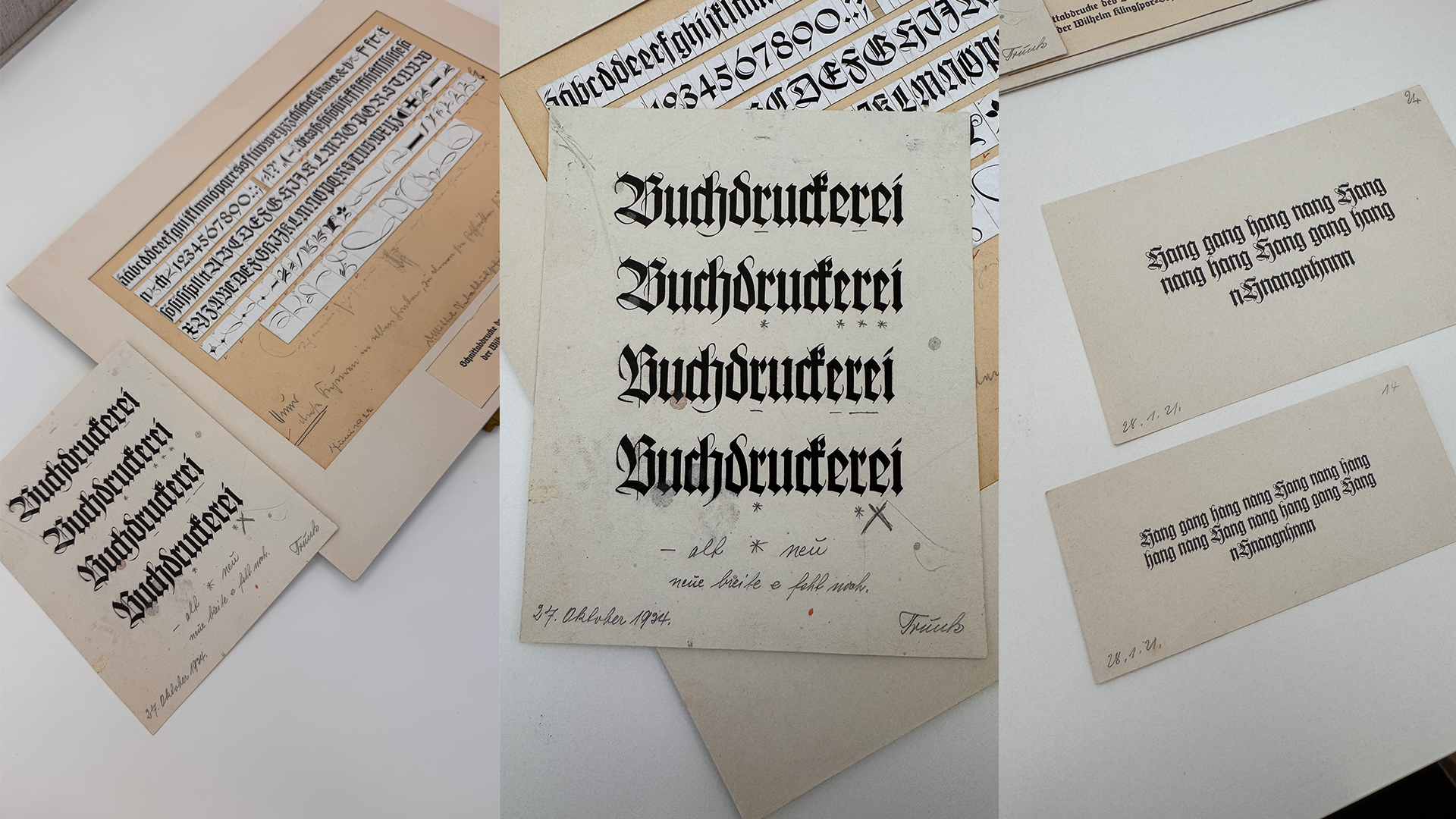
Wilhelm Klingspor Gotisch, beyond its specimen, is complemented by behind-the-scenes sketches that offer additional details and insights into the design. These sketches are just as fascinating as the finished typeface itself.
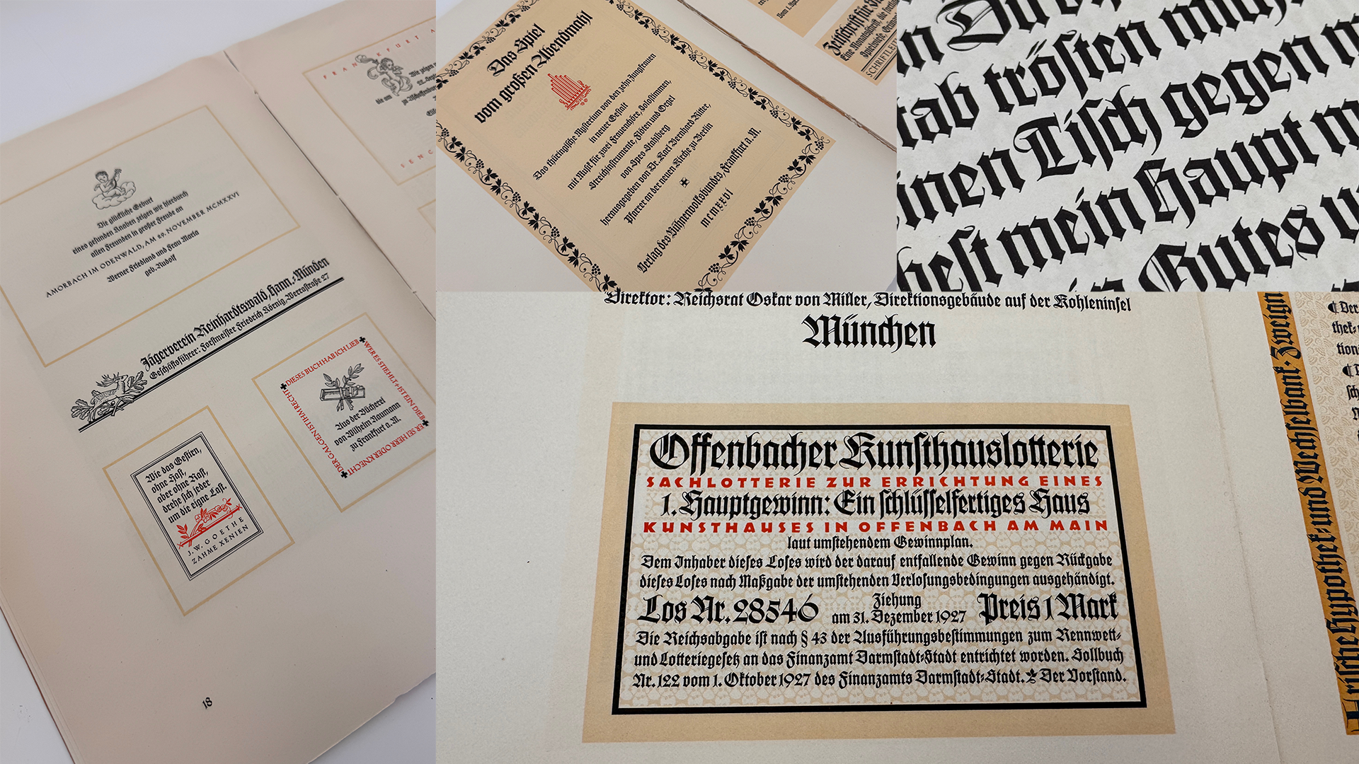
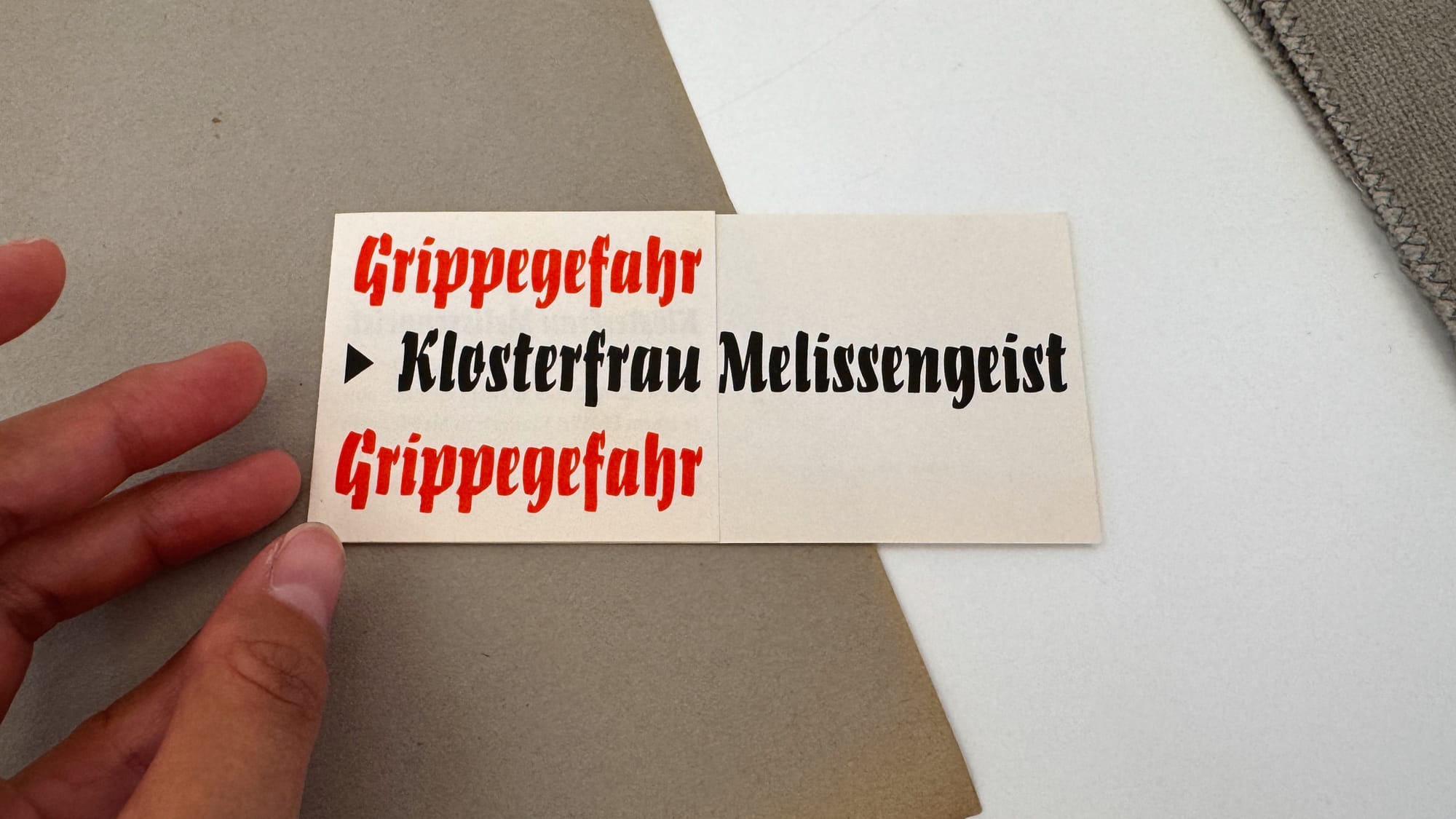
Designing type specimens or showcasing how a typeface could be used has always been a challenge for me. It’s usually the final step of the design process, and by then, all my energy has already gone into creating the typeface itself. As a result, I often struggle to create compelling specimens and lack the motivation to improve—until I discovered a collection of specimens at the Klingspor Museum. These specimens are presented as separate sheets of paper, organized in folders. Each sheet demonstrates different applications, such as cover letters, advertisements, and branding labels. Exploring multiple folders of these typeface specimens was both inspiring and enjoyable.
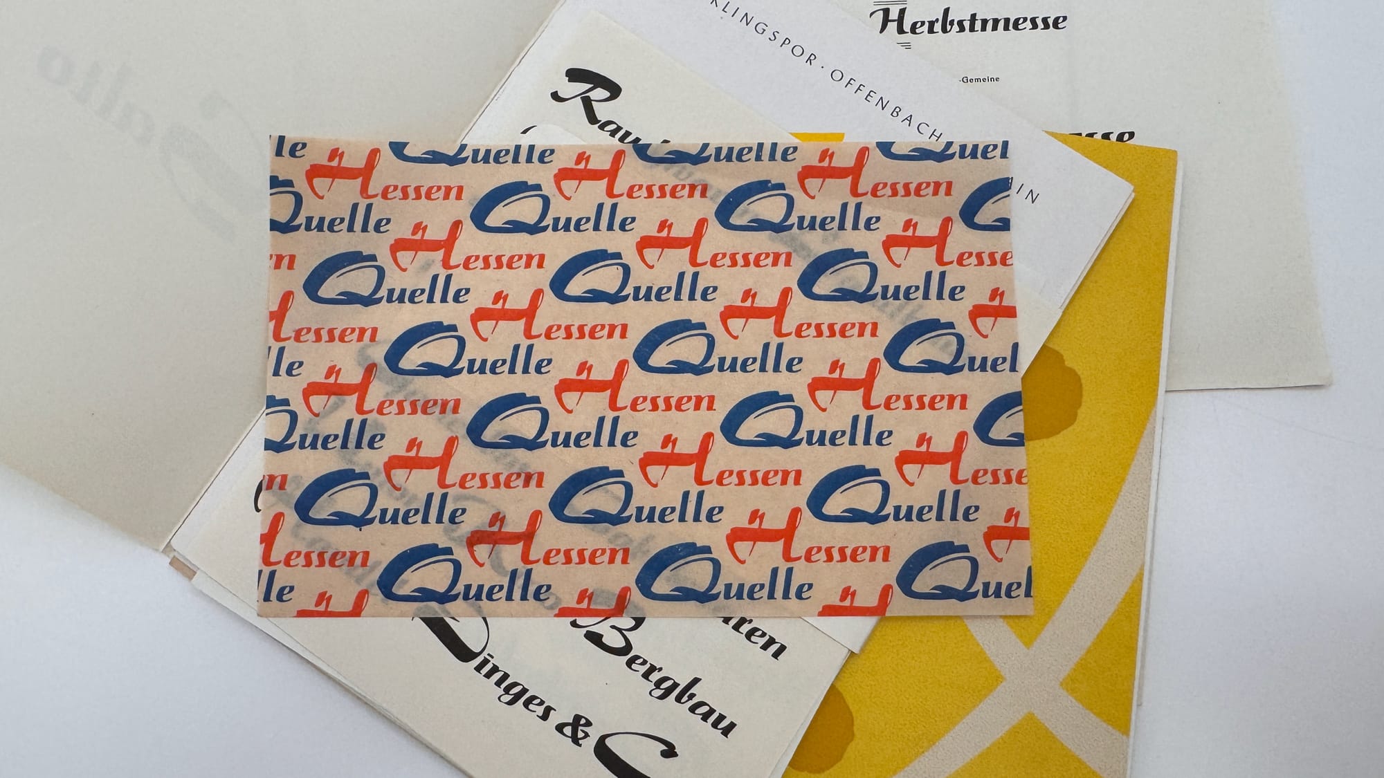
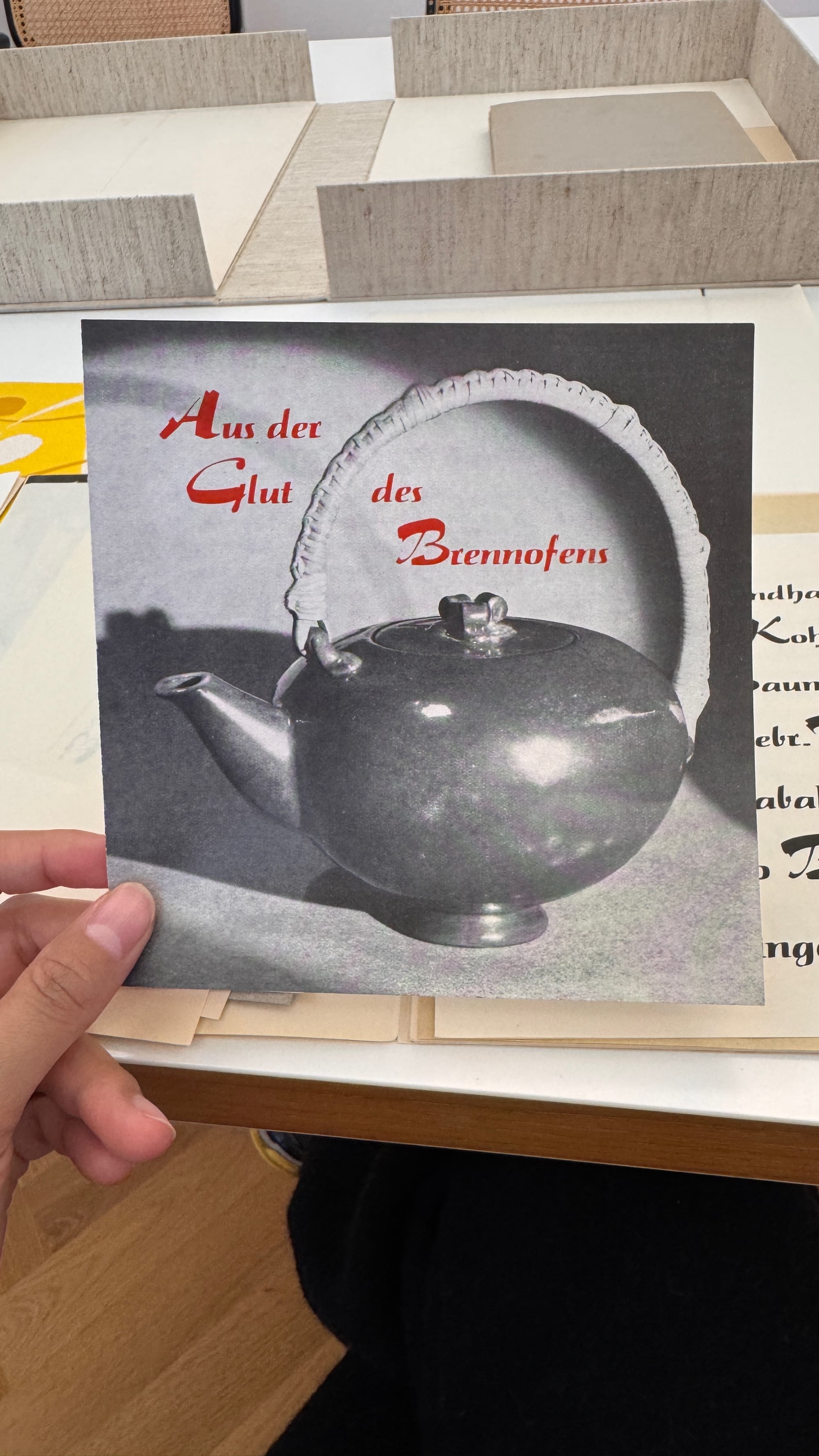
Specimens of Salto by Karlgeorg Hoefer
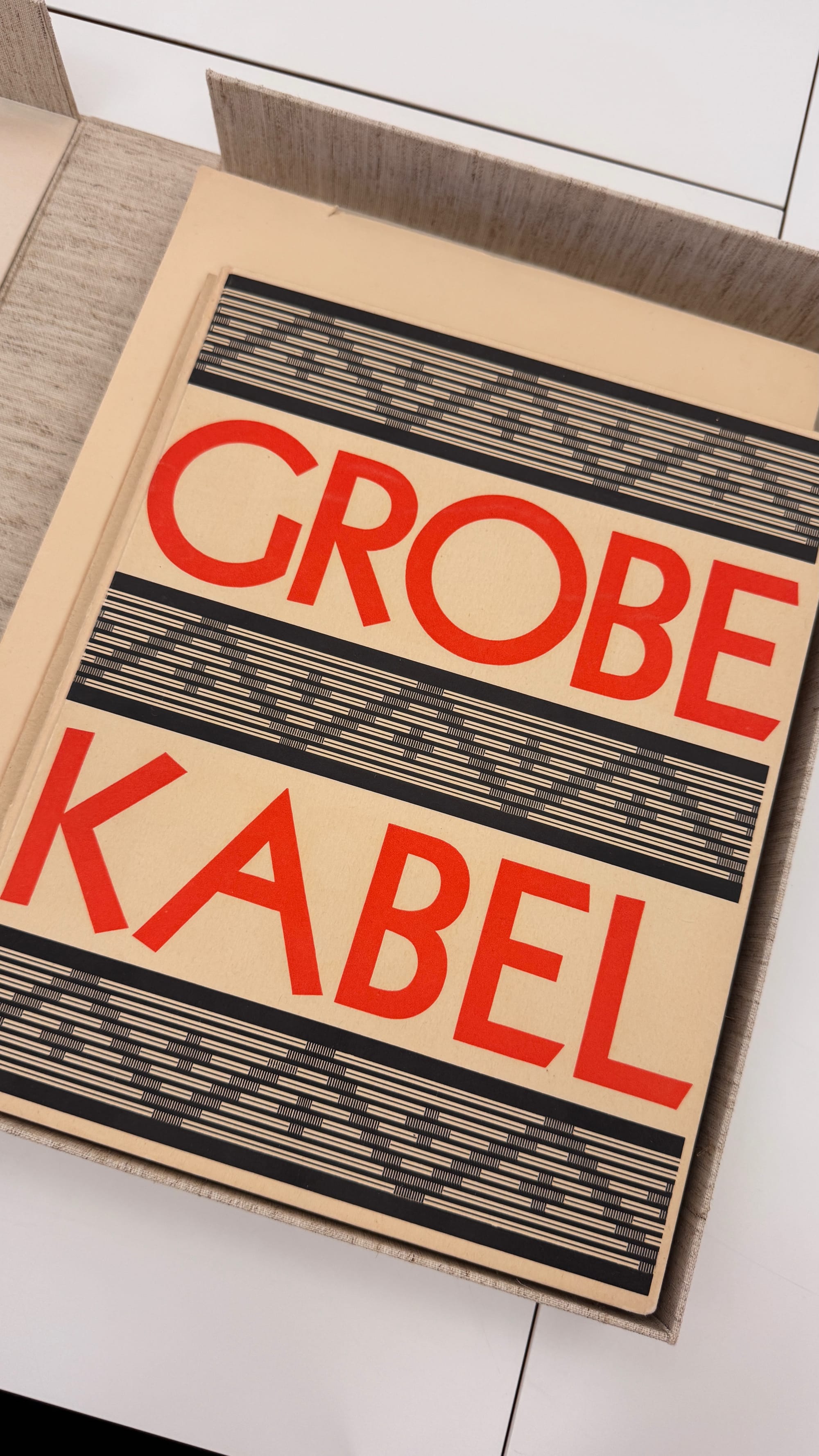
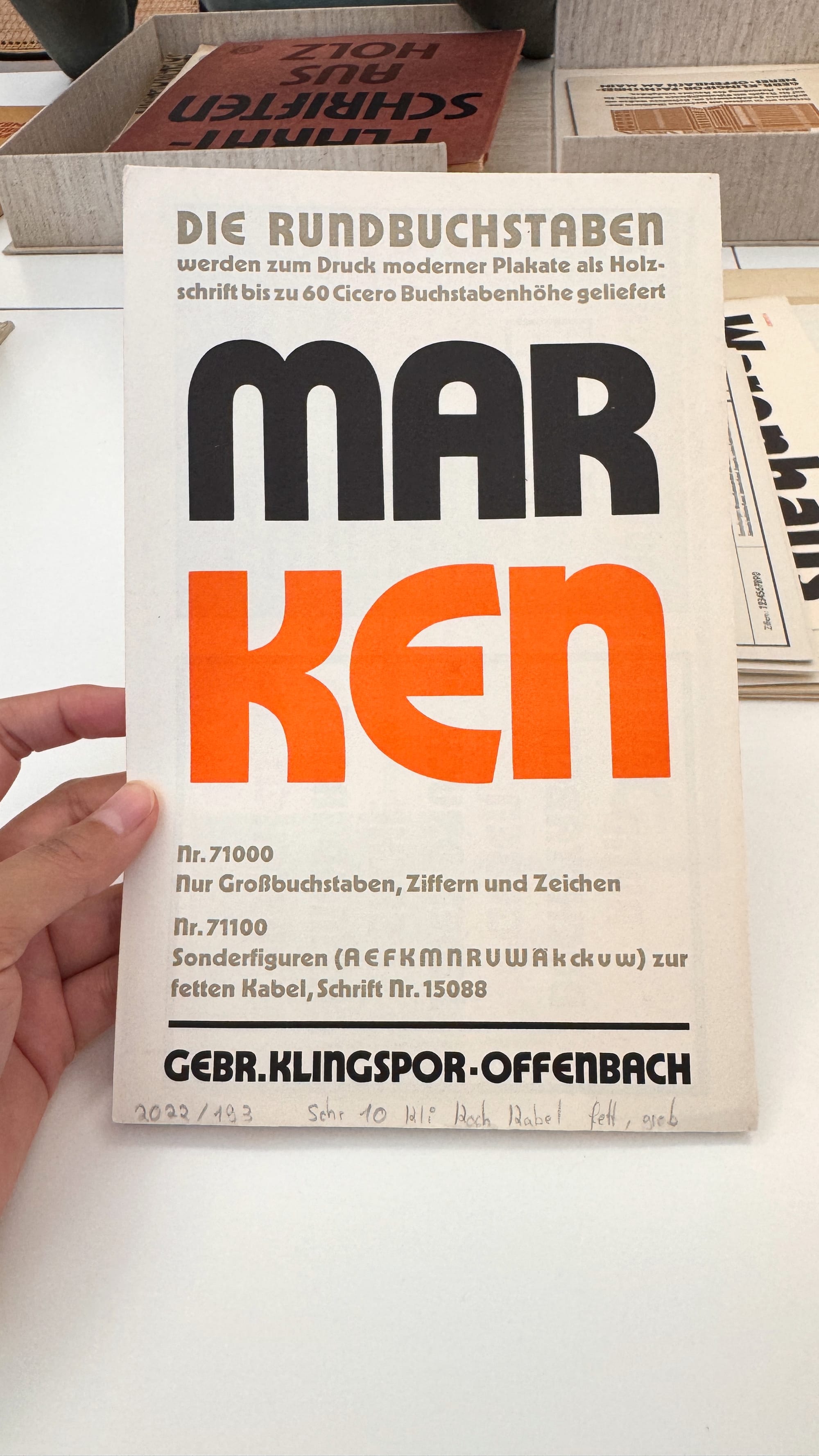
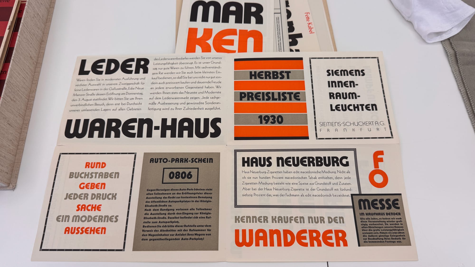
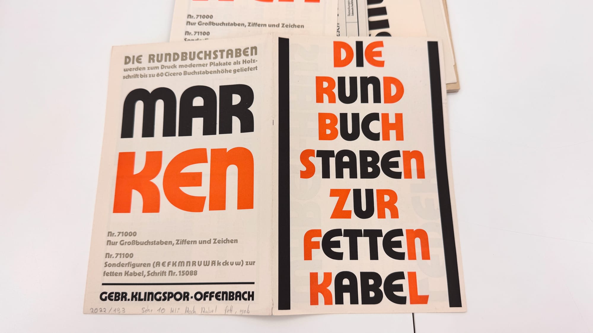
Specimen of Kabel by Rudolf Koch, showing alternate rounded forms (1928)
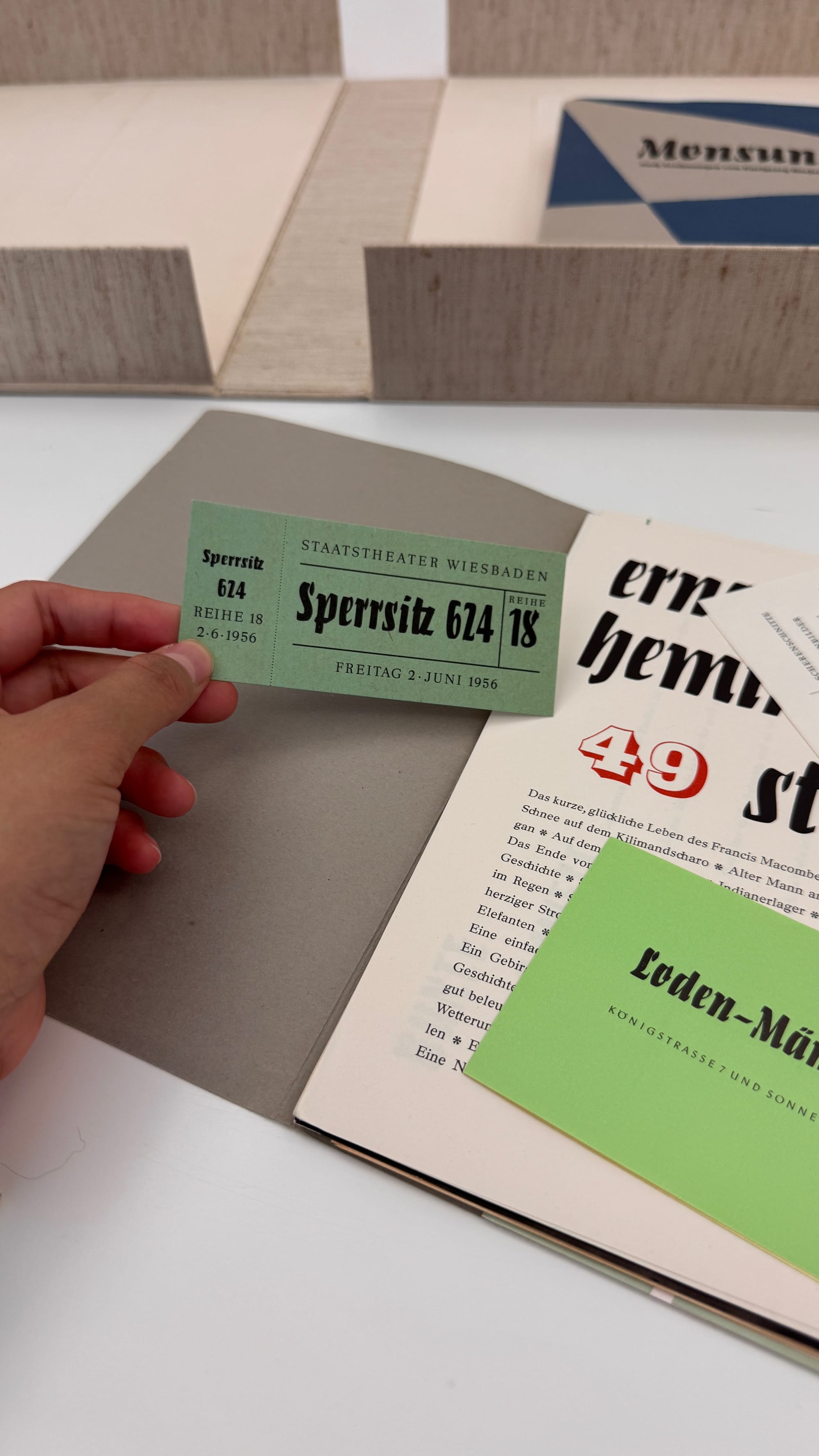
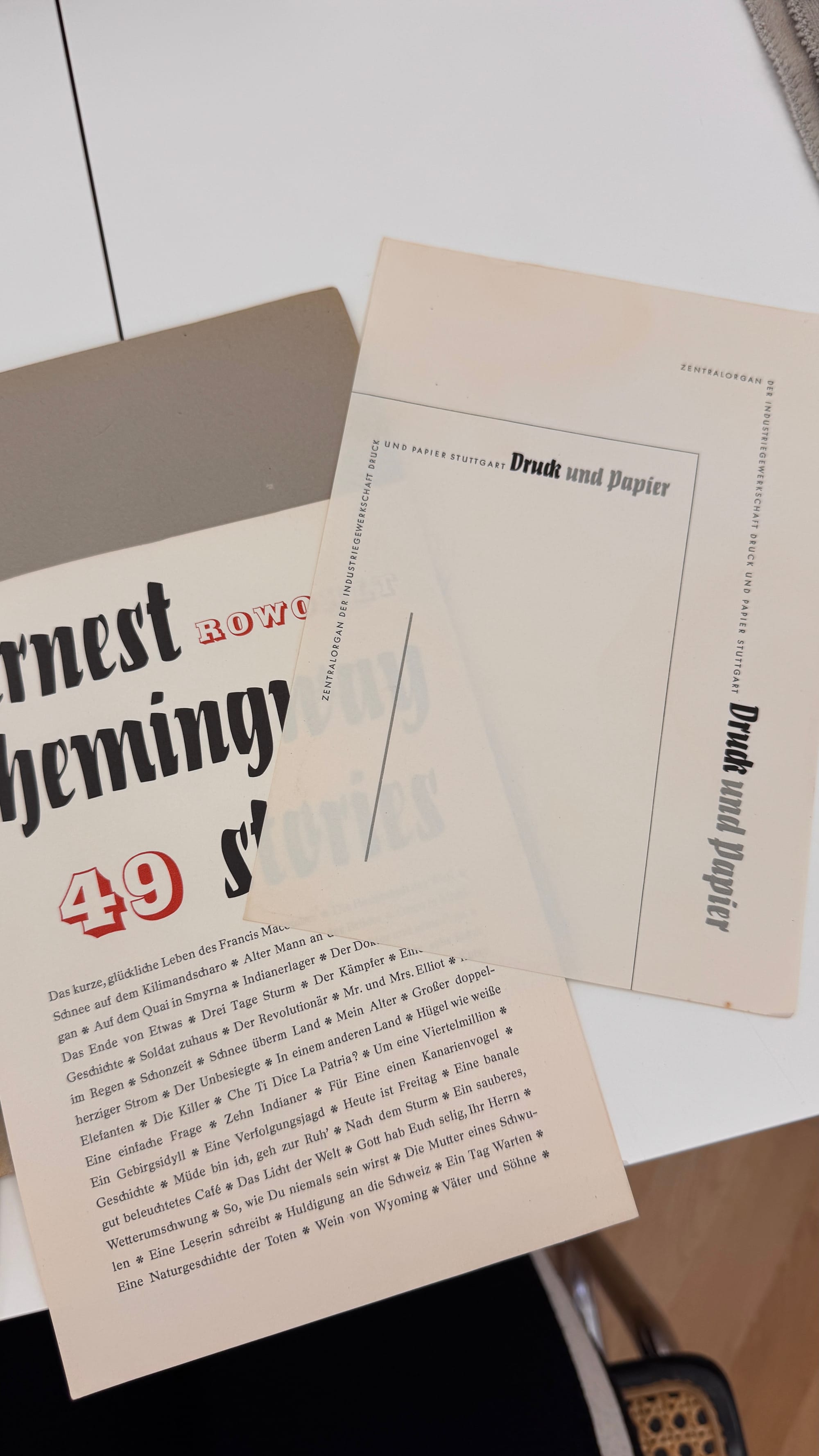
Monsun by Karlgeorg Hoefer
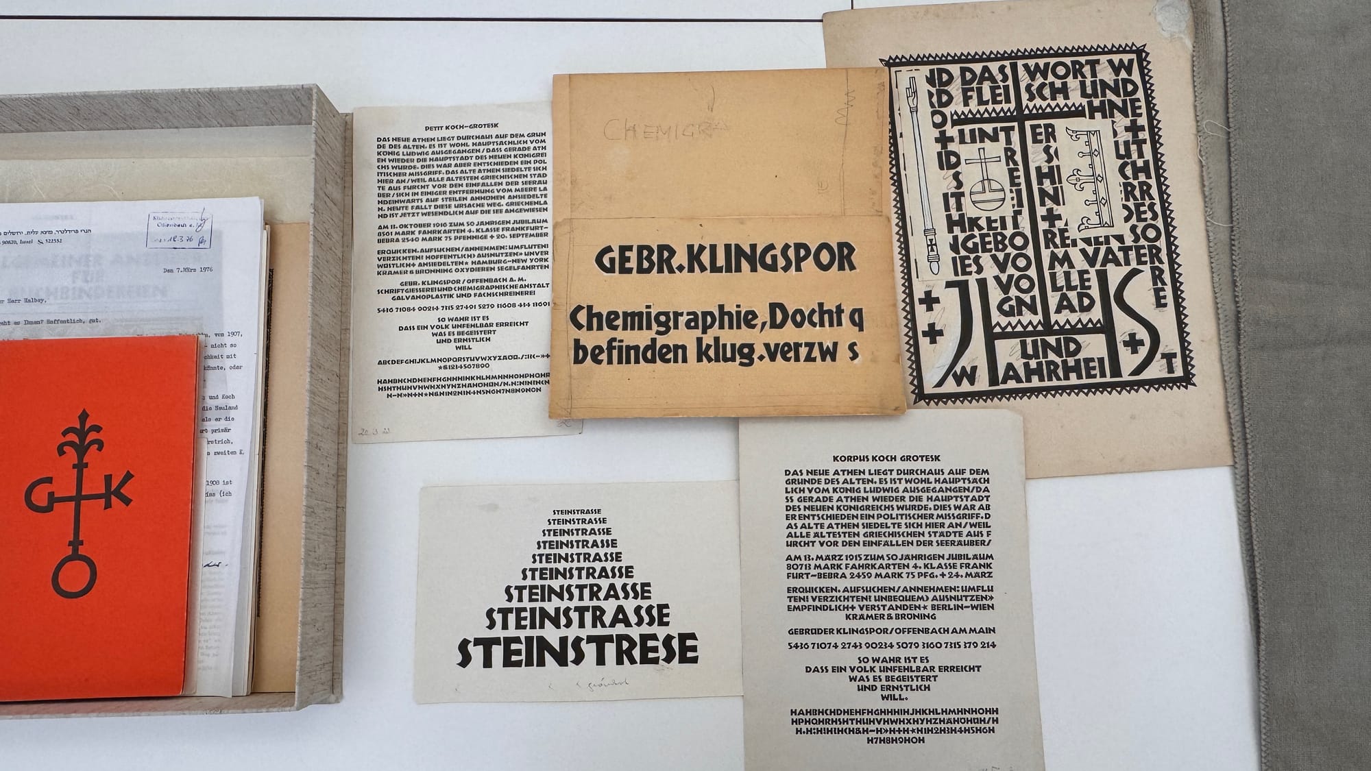
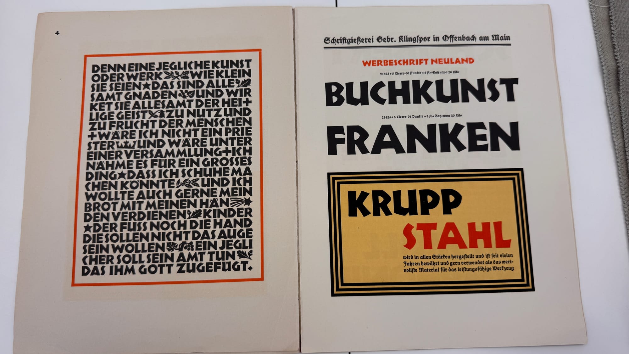
Neuland by Rudolf Koch
Last but not least, here is my highlight from all specimens, Salut by Heinrich Maehler. From the outside, the specimen is designed to look like a booklet, but once you open it, there are several sections cut in steps showing different in-use examples.
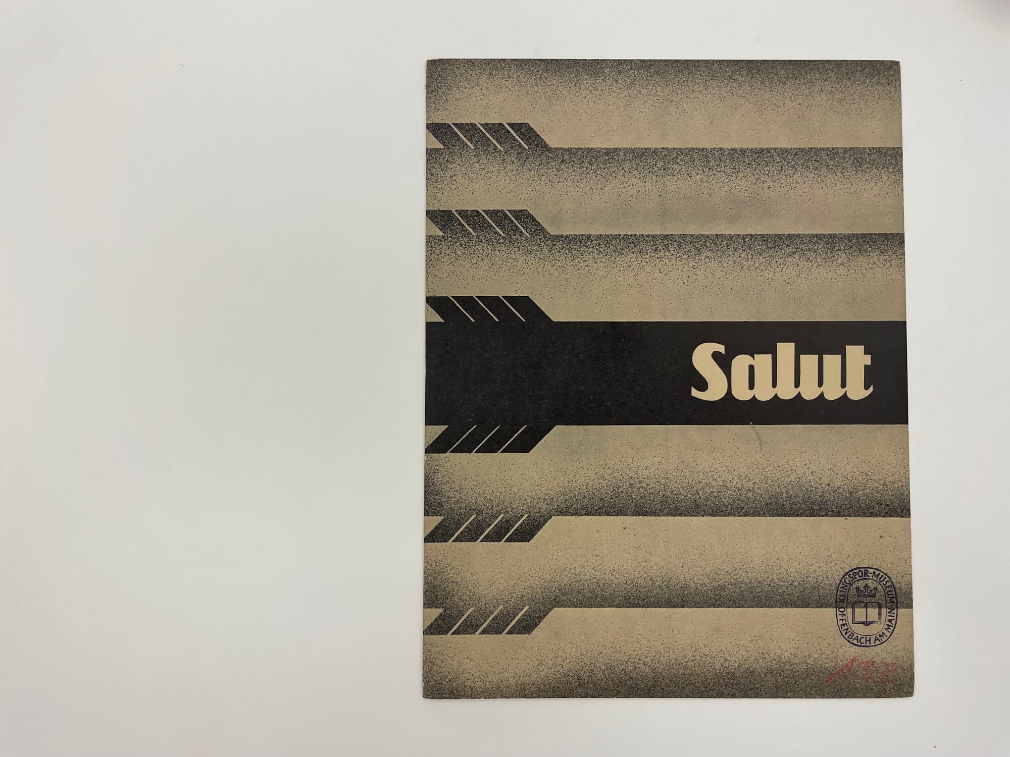
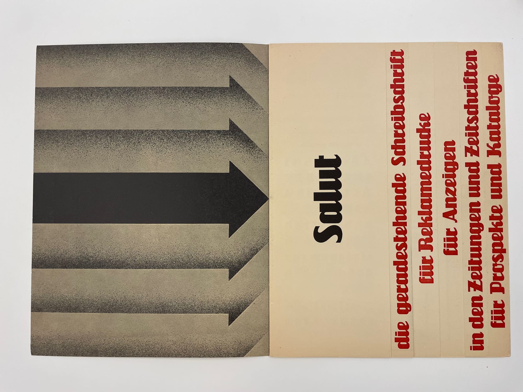
Salut by Heinrich Maehler. From left to right: 1. The closed specimen booklet 2. First page of the booklet.
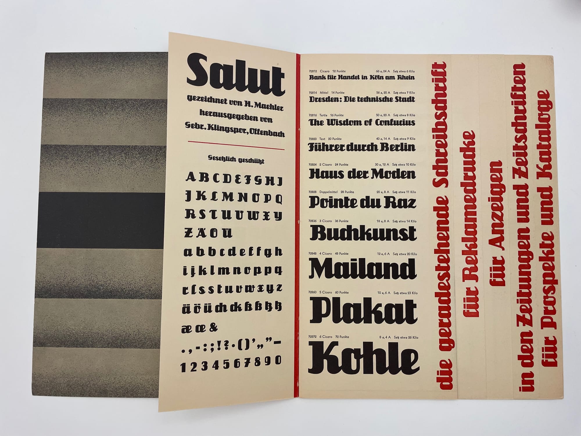
There was a moment I was wondering – “Who is Gebr. Klingspor?” — I found out that Gebr. Klingspor is not a person; it refers to a type foundry. The name “Gebr. Klingspor” is short for Gebrüder Klingspor, which means “Klingspor Brothers” in German. It was a prominent type foundry in Offenbach am Main, Germany, founded by Karl and Wilhelm Klingspor.
The time of my visit also overlapped with the Same Bold Stories exhibition. The article written by Fontstand, (linked here), provides more details about the exhibition.
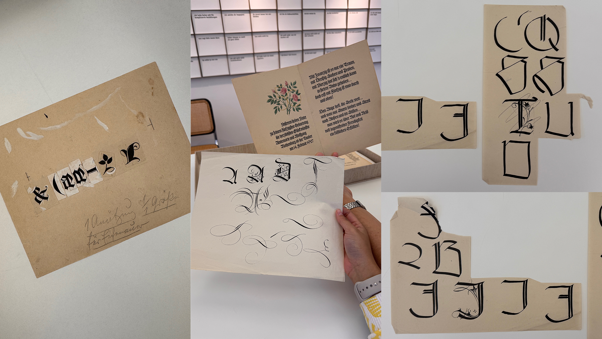
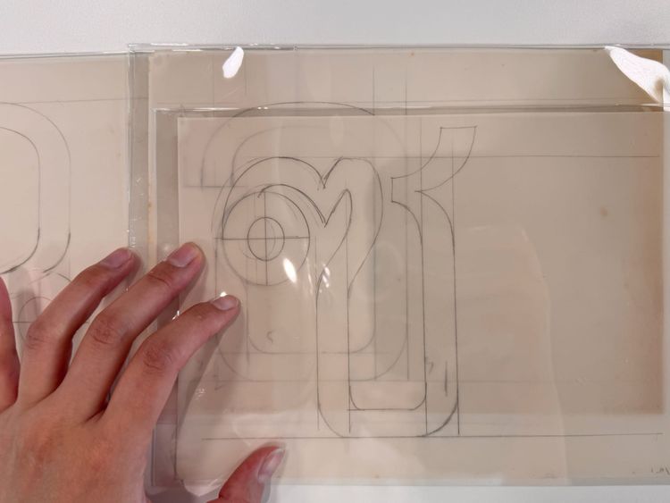
We had very little time to visit the exhibition (in the last hour before the museum closed), so I don't have a lot of good photos in this section. However, I was wandering there long enough to notice some artworks from female type designers of the past on display. And here are my favorite ones by Anna Simons. I cannot find a lot of information about her, but I found this book: Modern Pioneers in Typography and Design: Anna Simons, Edward Johnston, Rudolf von Larisch, F. H. Ehmcke. If anyone has additional leads, please feel free to comment or email me—I’d greatly appreciate it! 😊
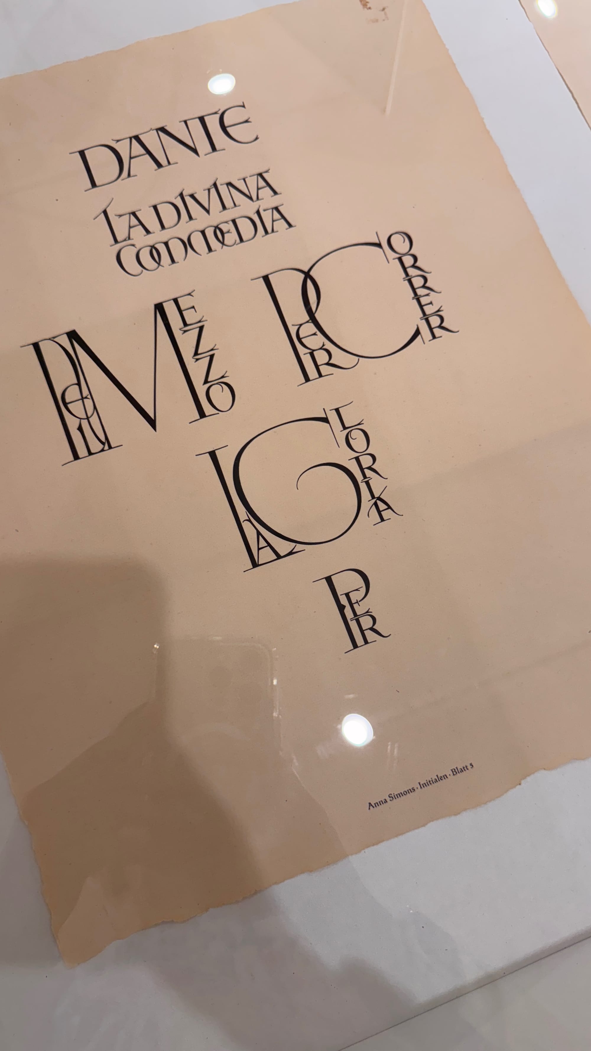
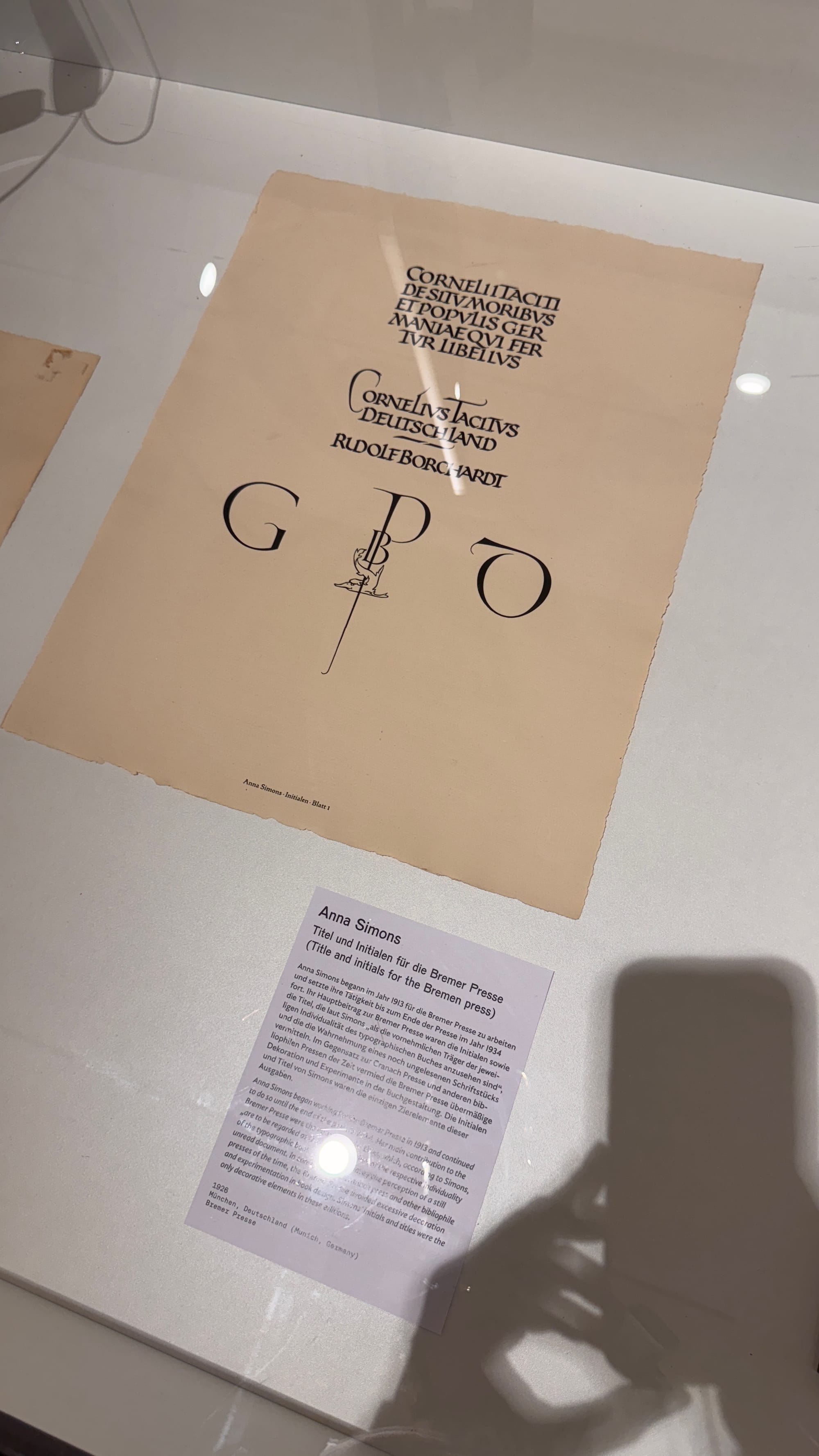
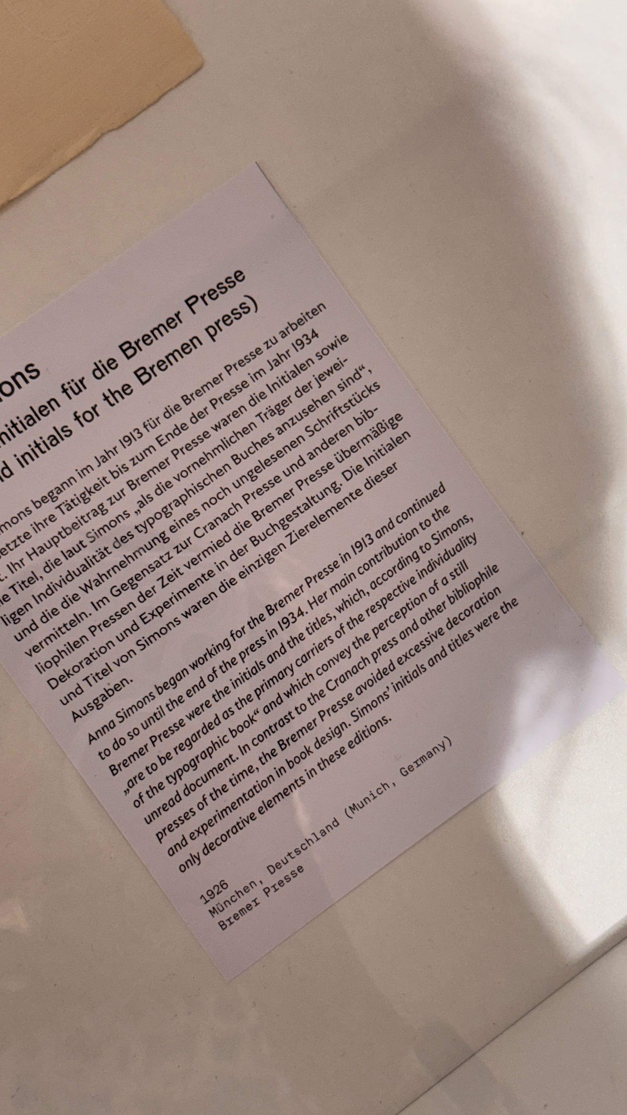
Anna Simons’ initials and title
To complete my little report here, I highly recommend the Klingspor museum to everyone! I hope to return and explore more, as what I saw was just a small glimpse of what is available.


Comments ()